Billcation - Facilitating the Settlements of Shared Trip Expenses Fairly, Efficiently
BillCation is an application that helps users record and calculate shared expenses for group trips more quickly and accurately using automatic calculations and data collection. It's an application that our group of three developed for a design competition, and we won it. As a UI/UX Designer, I was involved in the entire process, implementing design thinking to develop the proposed solution.
Year
2022
Role
UI/UX Designer
Background
For this design competition, my team and I established our product's central concept from the frustration that we often face when we go on trips with friends: making group trip shared expense splitting easy and precise. Our discussion started by sharing the challenges we faced during group trips. We all dealt with the same problem: “The hassle and exhaustion of jotting down shared expenses, figure out who owes whom, and how much. It's a real time-consuming.”
On group trips, people often take turns covering expenses. They need to track who paid for what, who owes money to others, and calculate each person's share. Double-checking the calculations for accuracy and attention to detail is crucial. This process can be time-consuming due to the need for meticulous data collection and calculations.
Fig. 1 - Our process
Emphatize
Understand the people
First we needed to understand who our users are and share in the emotions they experience while managing shared expenses on a group trip. We conducted user interview to gain understanding of how they might feel about the challenges, situations, or circumstances they encounter. We interviewed 10 people who have participated in a group trip and involved in shared expenses during the trip. From the interview, we were able to gather 2 user groups and able to understand their behavior, goals, needs, and frustration the participants were facing.
We implemented Toyota’s Five whys during interview. Toyota’s Five whys is an interview technique used to explore the cause-and-effect relationships underlying a particular problem. The goal of the technique is to determine the root cause of a problem by repeating the question "Why?" five times.
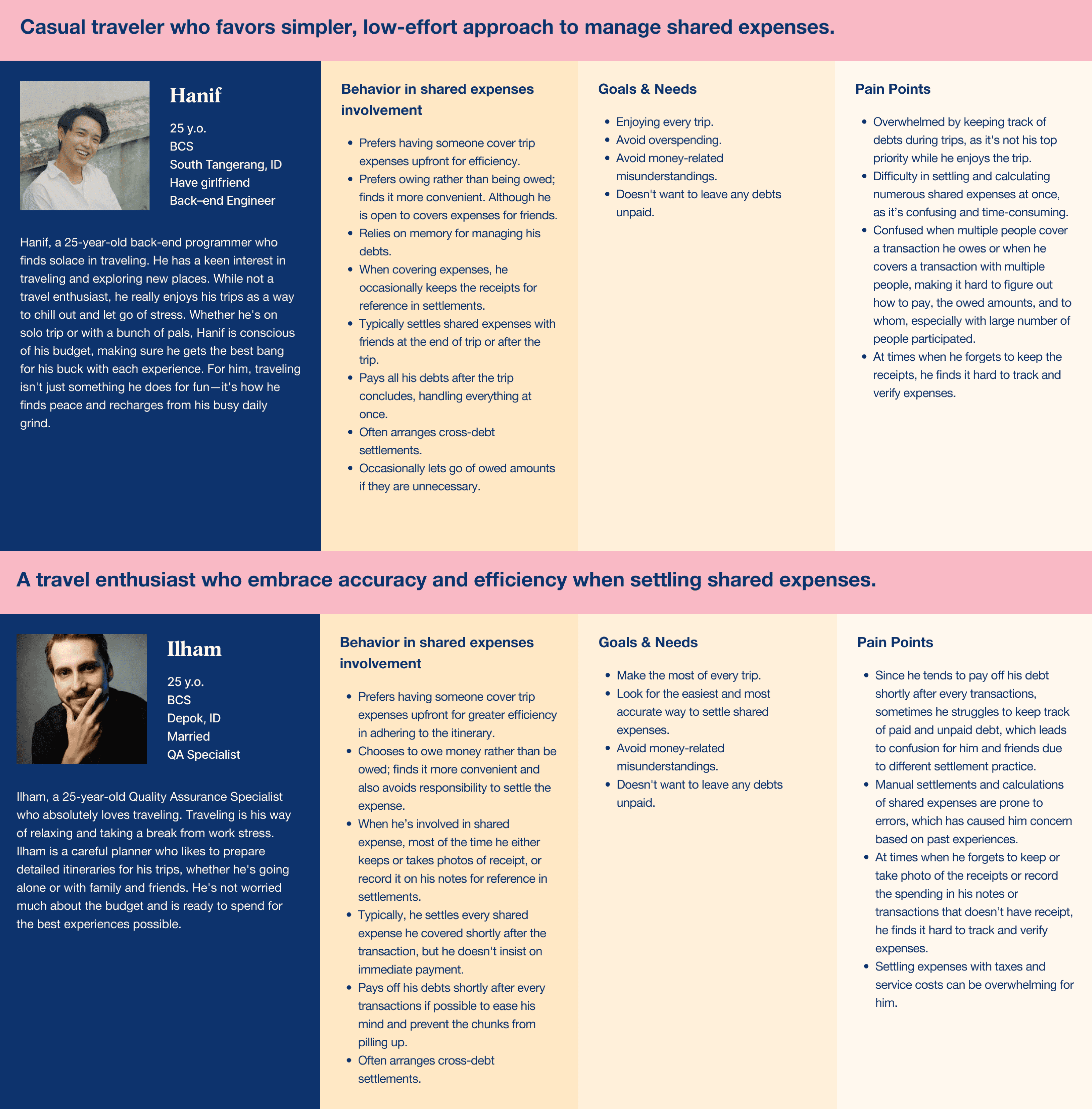
Fig. 2 - User Personas
Define
What is their experience?
We were also able to map their user journey to create a comprehensive visual representation of their experience. This journey map will highlight the various stages of interaction across all touchpoints, rom the initial discussion to determine who will pay for the transaction to the completion of the debt payment. At this point, based on their experience, they confirm our hypothesized challenge that this process is time-consuming and requires meticulous accuracy.
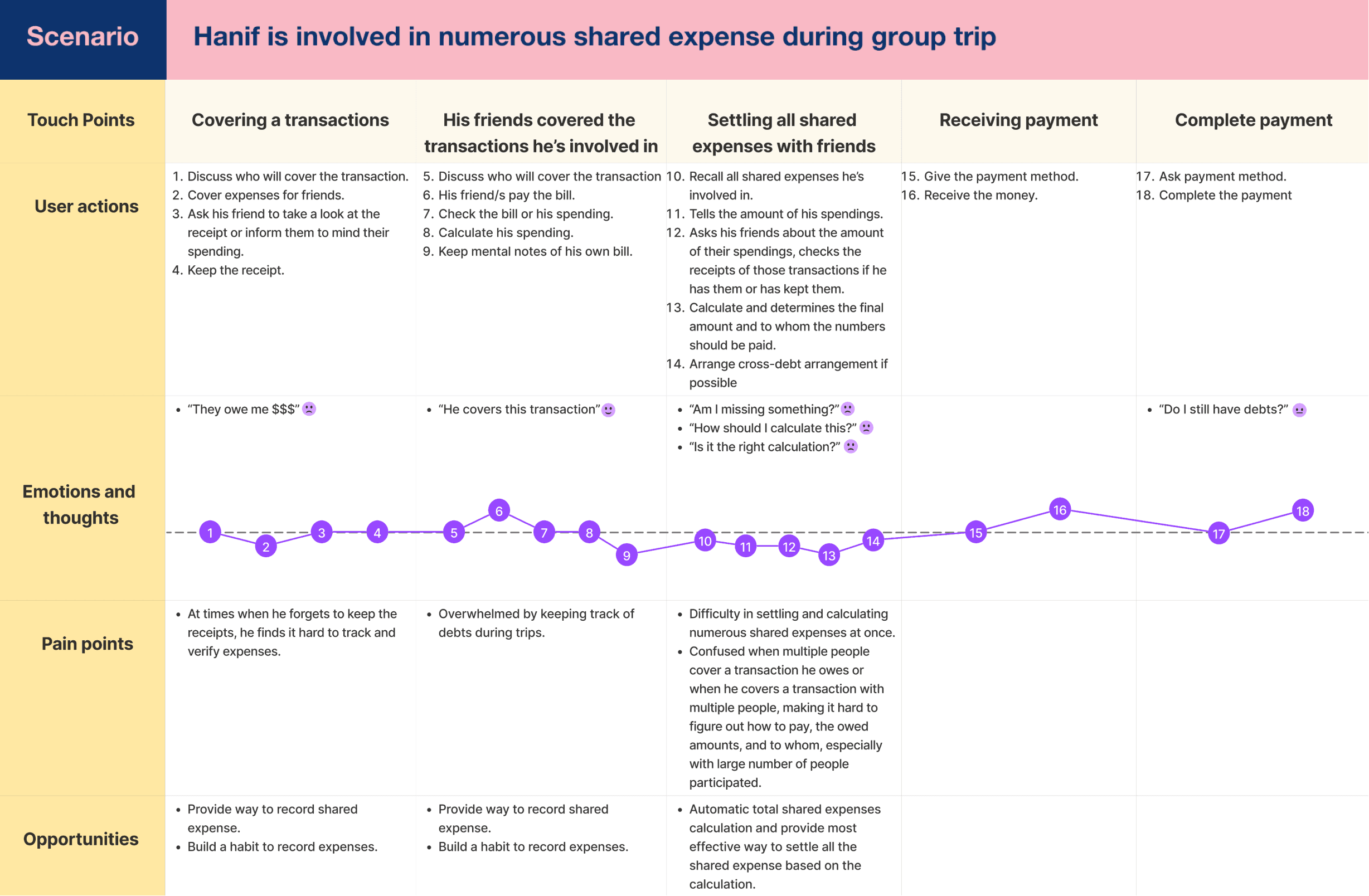
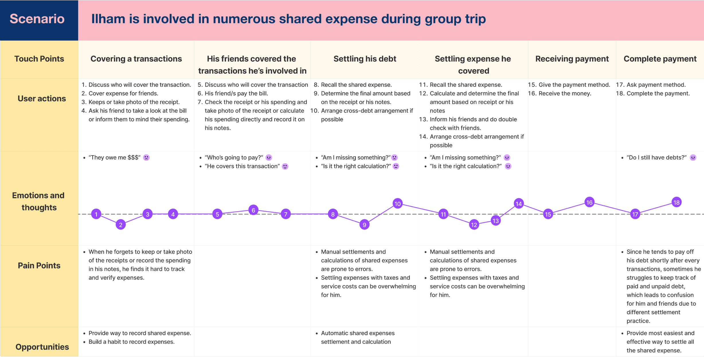
Fig. 3 - User Journey Map
What can we take from those people?
Post-interview, it's clear people grapple with shared expenses, from confusion in settling debts and manual errors to difficulties tracking expenses without proper documentation. The overwhelming nature of settling expenses, especially during trips and with various shared transactions, calls for a streamlined solution to enhance the overall experience of shared expense management, aiming to prevent money-related misunderstandings and helps them to ensure that no debts are overlooked—goals desired by all participants.
We believe calculating group shared expenses must be done carefully enabled by an application that helps users to record and calculate group shared expenses will help group trip to make the right distribution of expenses resulting in easy, faster and more accurate data collection and calculations.
So, our solution comes in the form of an app designed to make recording and calculating group road trip expenses much faster and more precise using automatic calculations and data collection to streamline the process.
What's the solution?
We created How Might We (HMW) Questions to foster creative solutions and maintain our focus on the issues uncovered in user interviews.
After brainstorming, our solution employs OCR for automatic receipt entries, along with manual entry for cases without receipts, to track individual expenses. It efficiently calculates total shared expenses, streamlines settlements, and automates trip accounting, including tax and service cost calculations—providing a seamless approach to managing group trip shared expenses. Additionally, with this solution, we encourage users to build a habit of recording shared expenses as reference for settling debts, thereby preventing misunderstandings related to money and ensuring that no debts are overlooked.

Fig. 4 - How Might We (HMW)
App functionality & what to accomplish
After deriving solutions from the HMW (How Might We) phase, we proceeded to articulate user stories, encapsulating the specific desires and actions users would like to see and undertake when engaging with the app. This user story process served as a crucial step in refining and specifying our design solutions based on a profound understanding of issues discovered in previous phases.
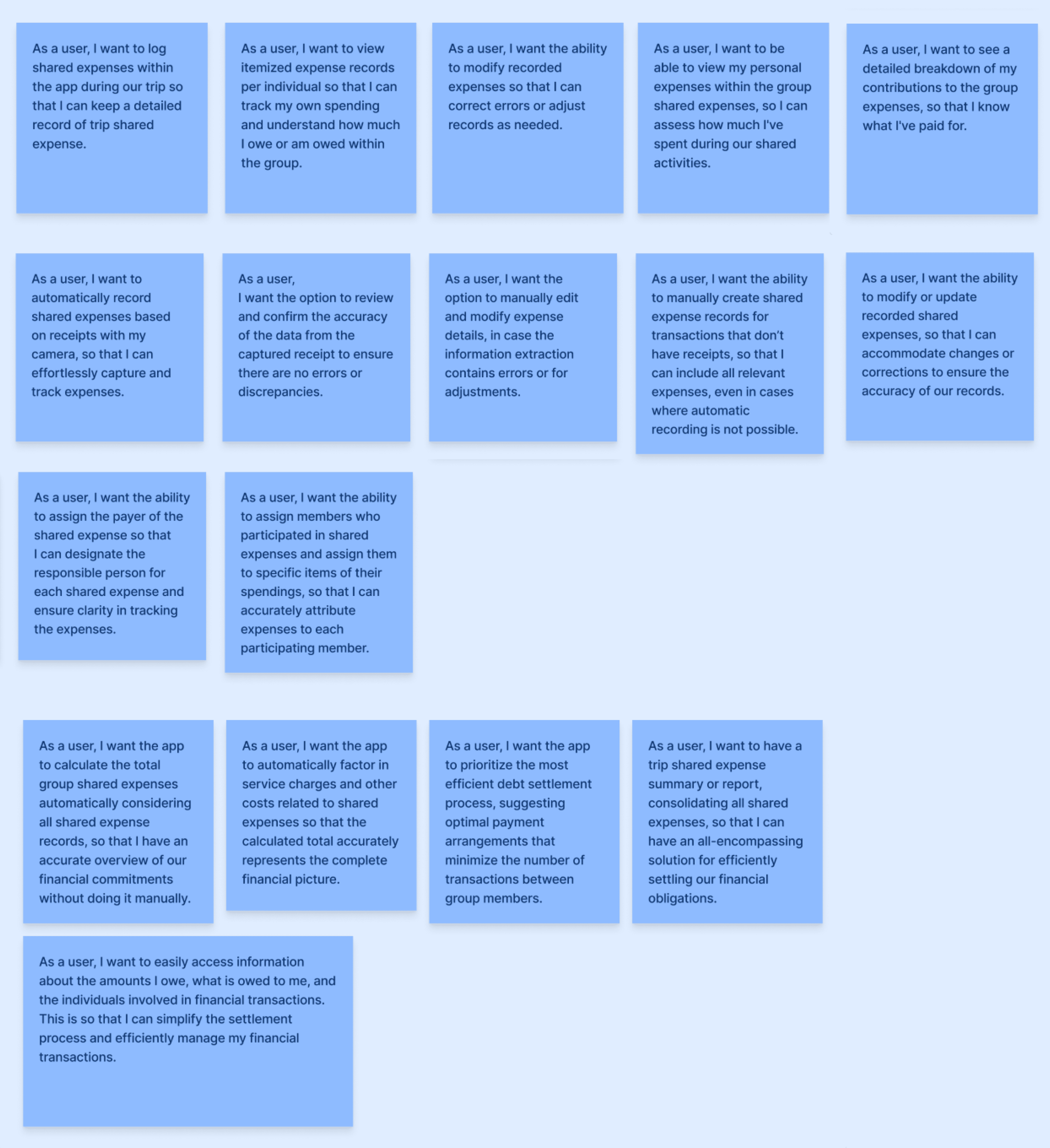
Fig. 5 - User Stories
Create
User Flow
From each user story, we transformed it into user flow to show the path a user will take in application to complete the task. We created the user flow on paper because it was easier for us at that time.
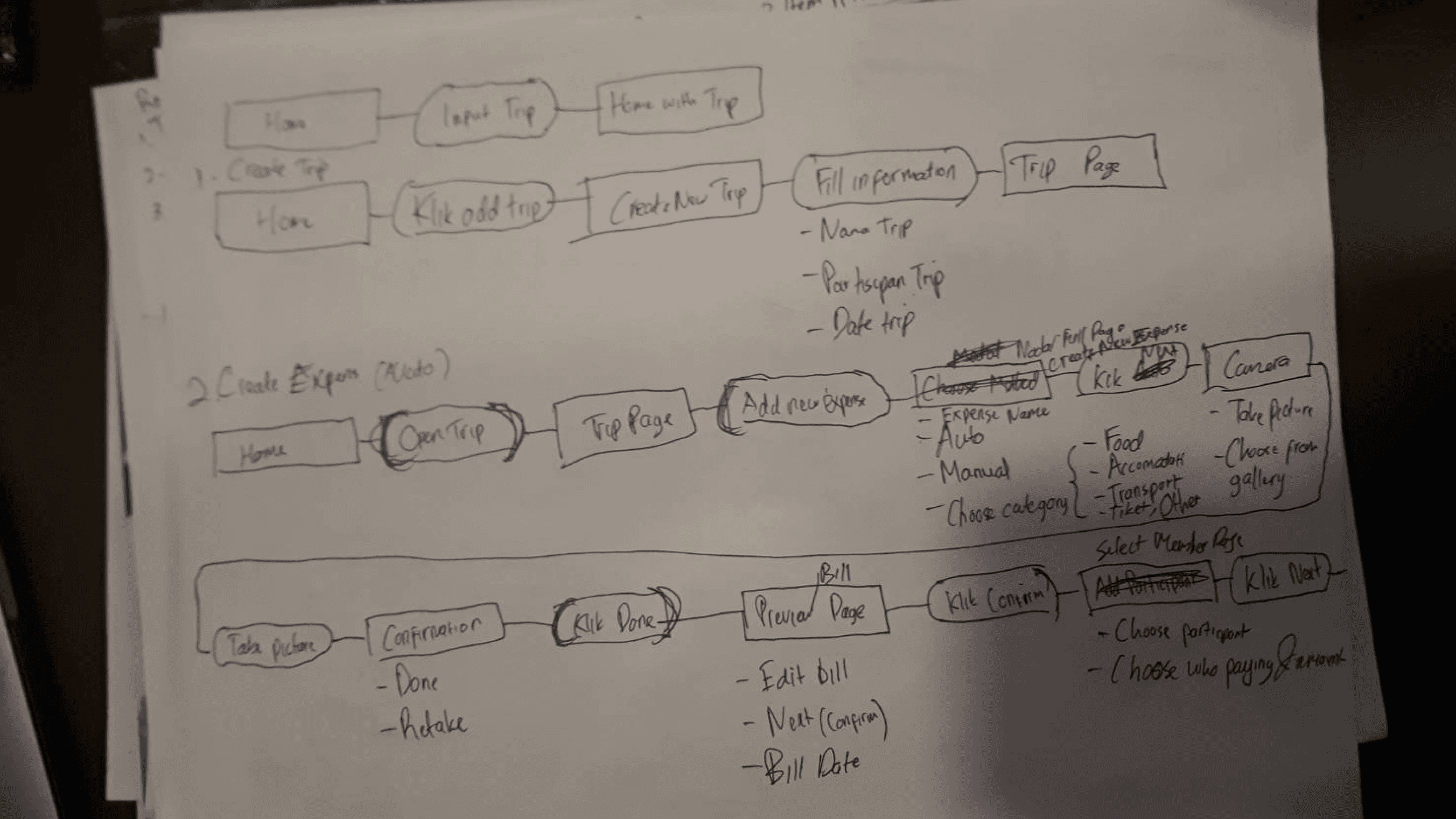
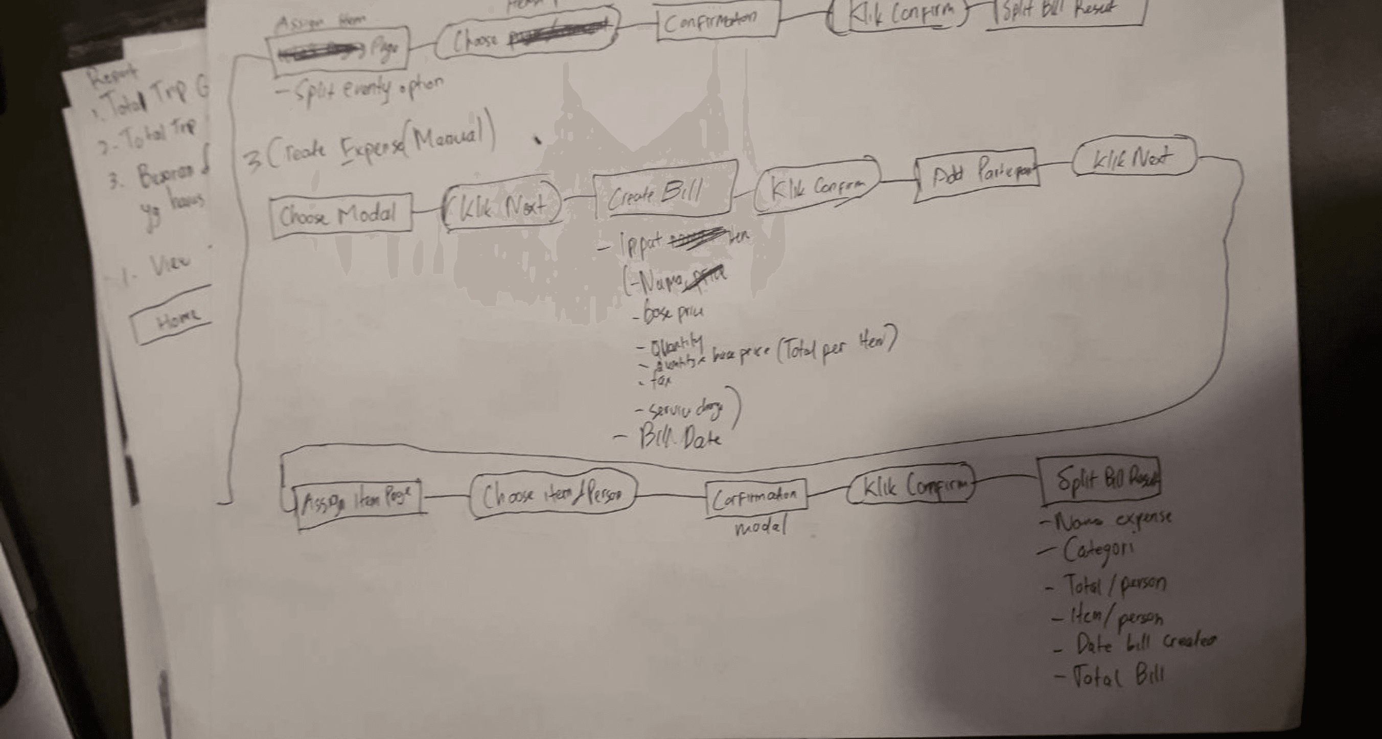
Fig. 6 - User Flows Created on Papers
Outlining structure and visuals
After we have a clear idea from the previous processes, we created wireframes to provide a clear overview of the page structure and demonstrate what interface elements will exist on each page. We also created wireflows as a visual representation of the screens and interactions a user follows to complete tasks. To help us speeding up the wireframing process, we created this in Figma and used a plugin called “Ink Wireframe” as it provides some basic wireframe components so we didn’t need to create the new one.
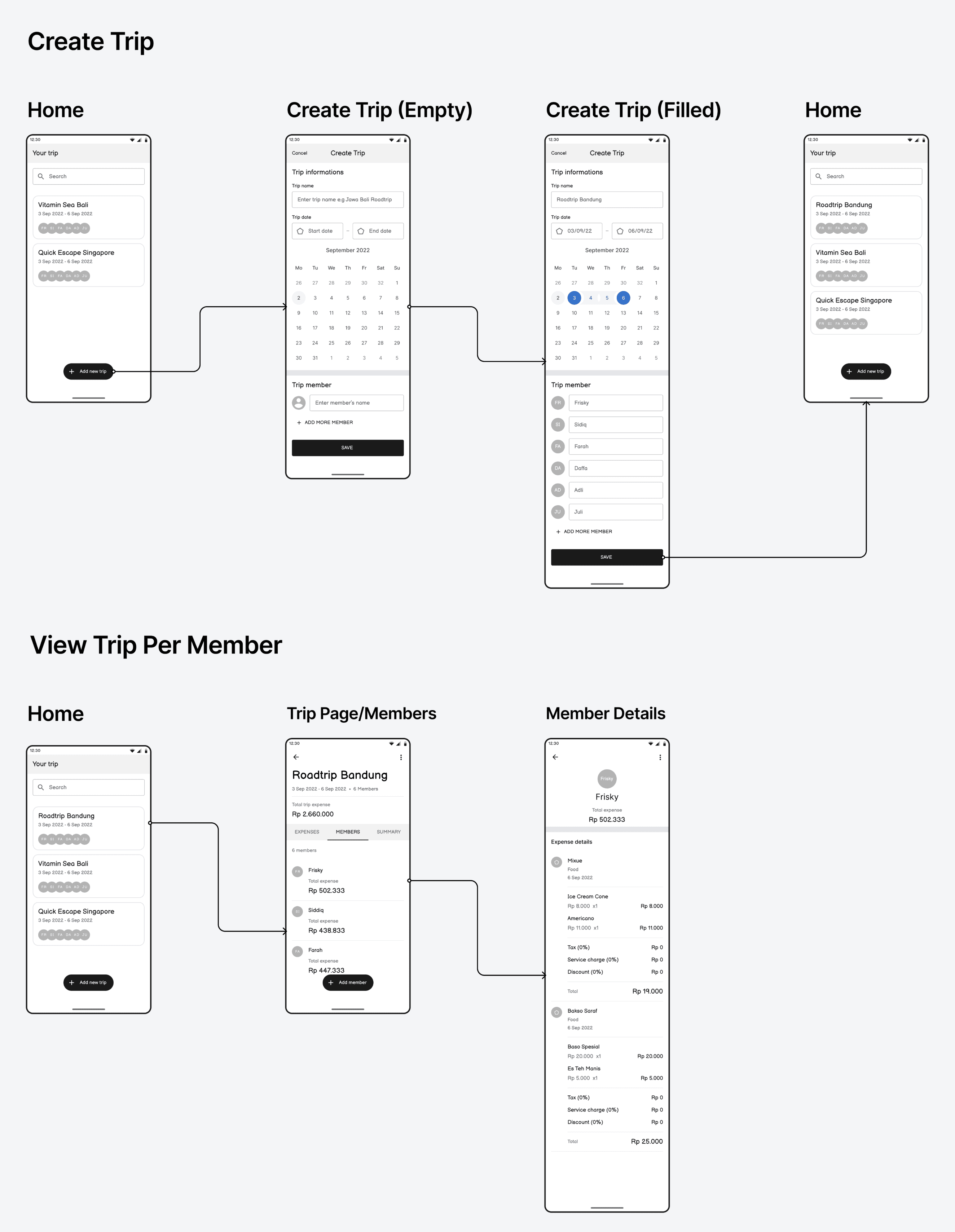
Fig. 7 - Wireframe & Wireflow
How this app actually looks
At this stage, we transformed each wireframe into actual app design in Figma. We sought for minimalist and clean design.
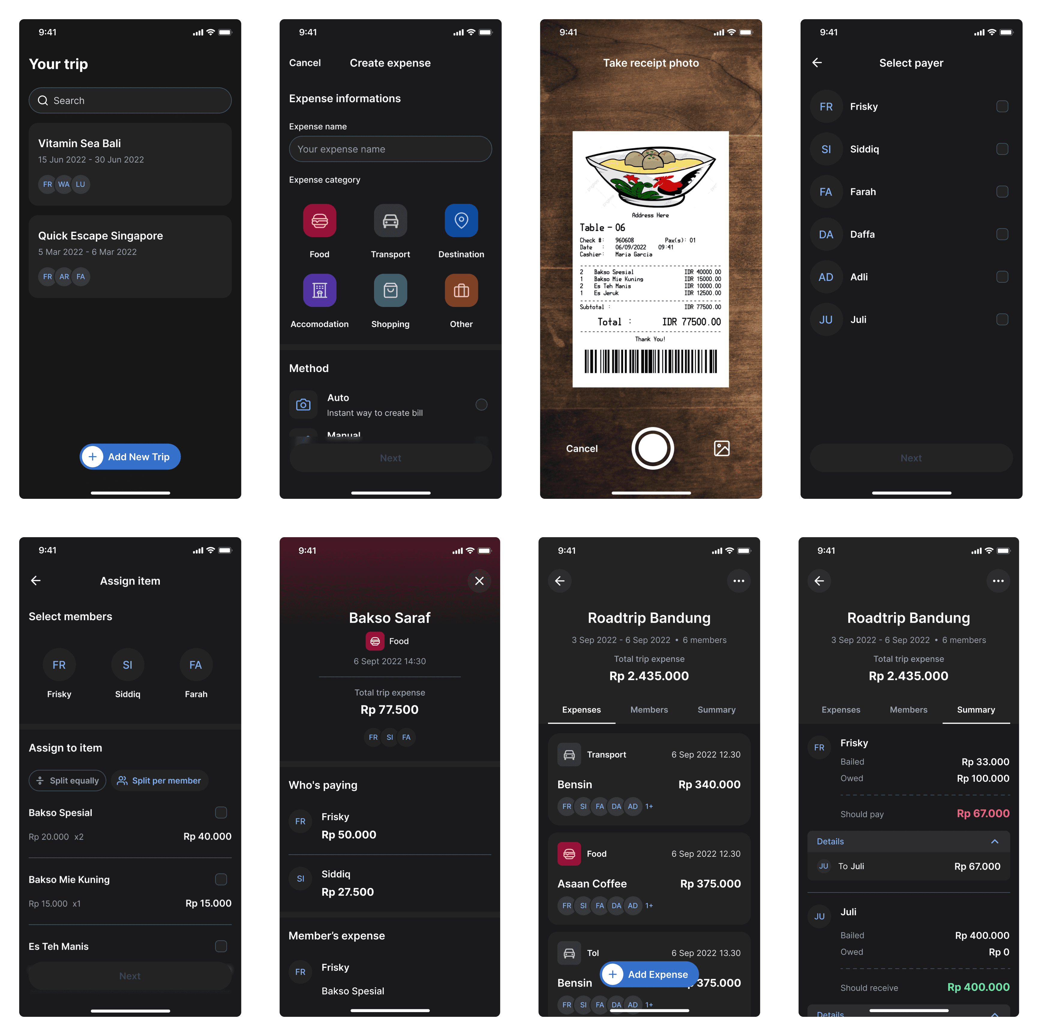
Fig. 8 - Hi-Fi Design
Features
Automated Bill Documentation using Optical Character Recognition (OCR)
We aimed to streamline bill documentation, offering automation through BillCation. By simply scanning the receipt with the camera, BillCation automates the bill documentation process, effortlessly settling all shared expenses. Additionally, we provide manual entry creation for cases without receipts. This initiative is also part of efforts to instill expense tracking habits among trip members, aiming for fair, transparent, and efficient debt settlements facilitated by the app.

Fig. 9 - Receipt Photo-Taking Screen
Group & Personal Expense Record
BillCation helps to effortlessly track both group and personal shared expenses, providing a comprehensive view of group and personal financial interactions during trip. No more debts being overlooked.
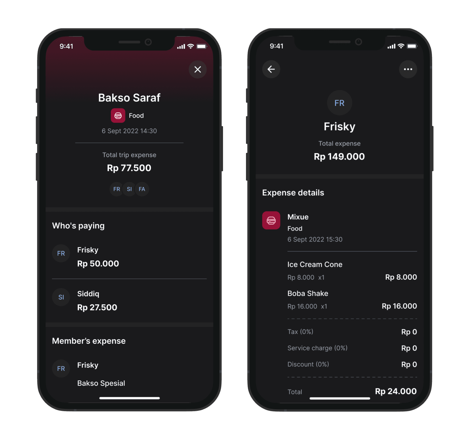
Fig. 10 - Transaction Detail Screen for Bakso Saraf (Food) & A Trip Member's Personal Shared Expense Record for Frisky (Person)
Automatic Shared expense Calculations and settlements
Reviewing bills to balance everything can be time-consuming. That's where the App comes in – Our 'Summary' section enables users to swiftly understand payables and recipients. BillCation automates the computation of total group shared expenses from shared records, offering the most efficient debt settlement process for all parties involved at once. This significantly reduces the time needed to settle everything.
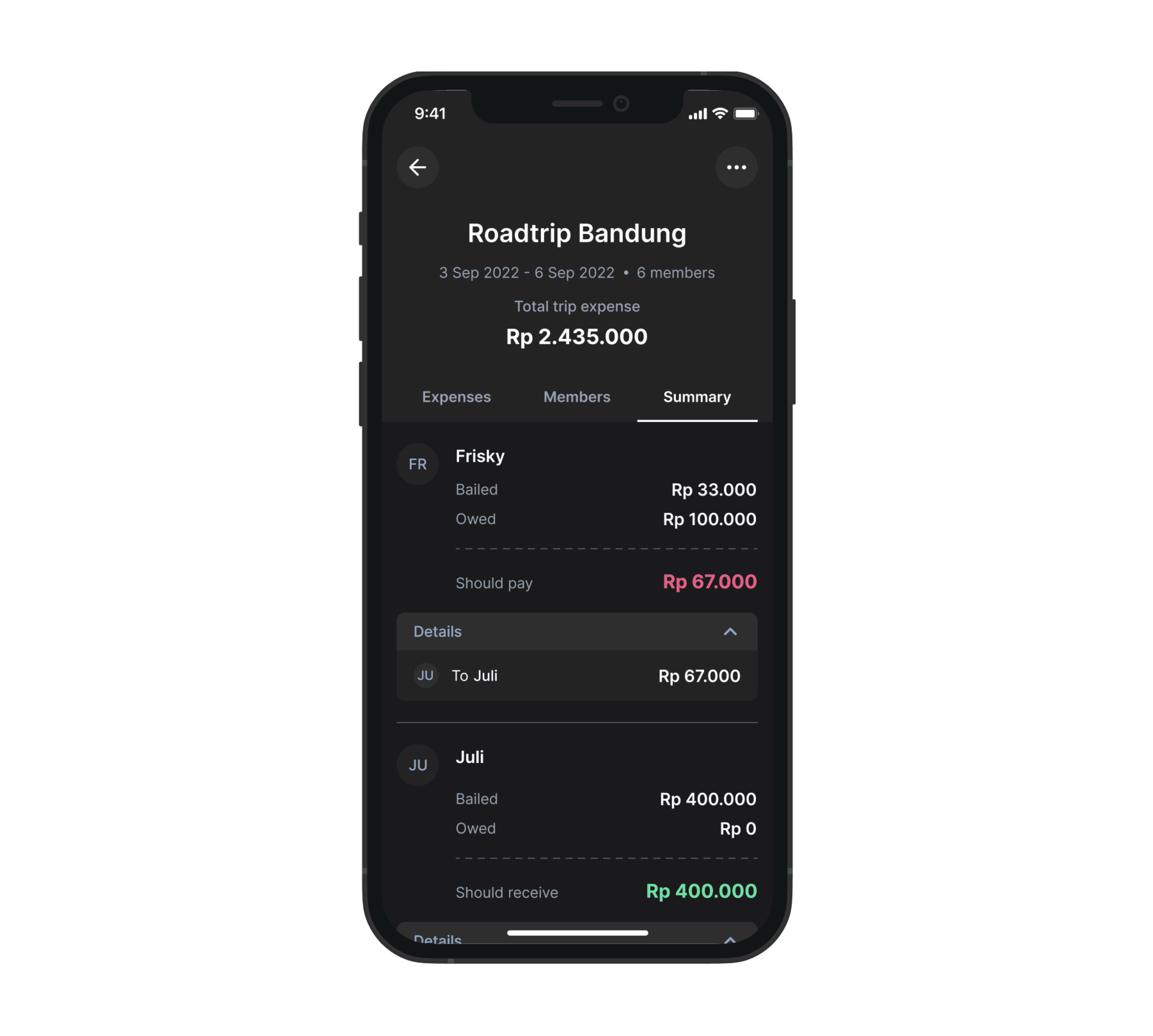
Fig. 11 - Trip Summary Screen for Roadtrip Bandung (Trip Name) Displaying All Payables and Recipients
Testing
Usability Testing & Results
After the design was completed we tested the prototype with 5 representative users to verify the usability and effectiveness of our solution in addressing the problem. Participants were given the certain tasks to complete based on the our proposed solutions. We conducted this test using Maze.
All participants succeeded to do all tasks. But we still had to dig deeper to see how they interacted with the prototype and created pattern identifications based on heat map, click path and completion paths. We also collected some feedback during the test.
Fig. 12 - Usability Testing Result
Pattern Identification #1
3 out of 5 subjects had a hard time selecting method for recording the expense and constantly switching between auto or manual when they first time interacted with it for the first time during test. This means that for some users, they were not confident to determine which method they should use.
Fig. 13 - Before and After Comparison of Text Copy in the Create Expense Screen
We found the label didn't explain the menu well or help users navigate. So, we changed it to something clearer, making sure users know what happens when they choose options.
Pattern Identification #2
5 out of 5 subjects got lost in the process of assigning people to item they bought. They took quite some time to figure out how to do it. This means that for some users, it’s immediately not clear how to assign people to item they bought.
Fig. 14 - Before and After Comparison of Assign Participant to Item Screen
We introduced a walkthrough with a modal and animated hotspots to help users assign items in transactions. Additionally, a 'Help' icon allows users to replay instructions when needed.
Pattern Identification #3
5 out of 5 subjects clicked the text label of the checkbox/radio button instead of the checkbox/radio button itself. This means that they expect the text to be a touchpoint also.
Fig. 15 - Before and After Comparison of Clickable Area in the Create Expense Screen
Originally, users could only tap checkboxes/radio buttons. We improved it to allow selection via the text label as well.
Pattern Identification #4
1 out of 5 subjects commented that when he was selecting the payer and entering the amount, he got lost on which transaction he was currently recording and how much the amount of the spending was due to lack of reference.
“While choosing the payer and entering the amount, I forgot which transaction I’m currently recording and the total amount of the expense, so I have to go back to the previous page to check it.” - R, 25
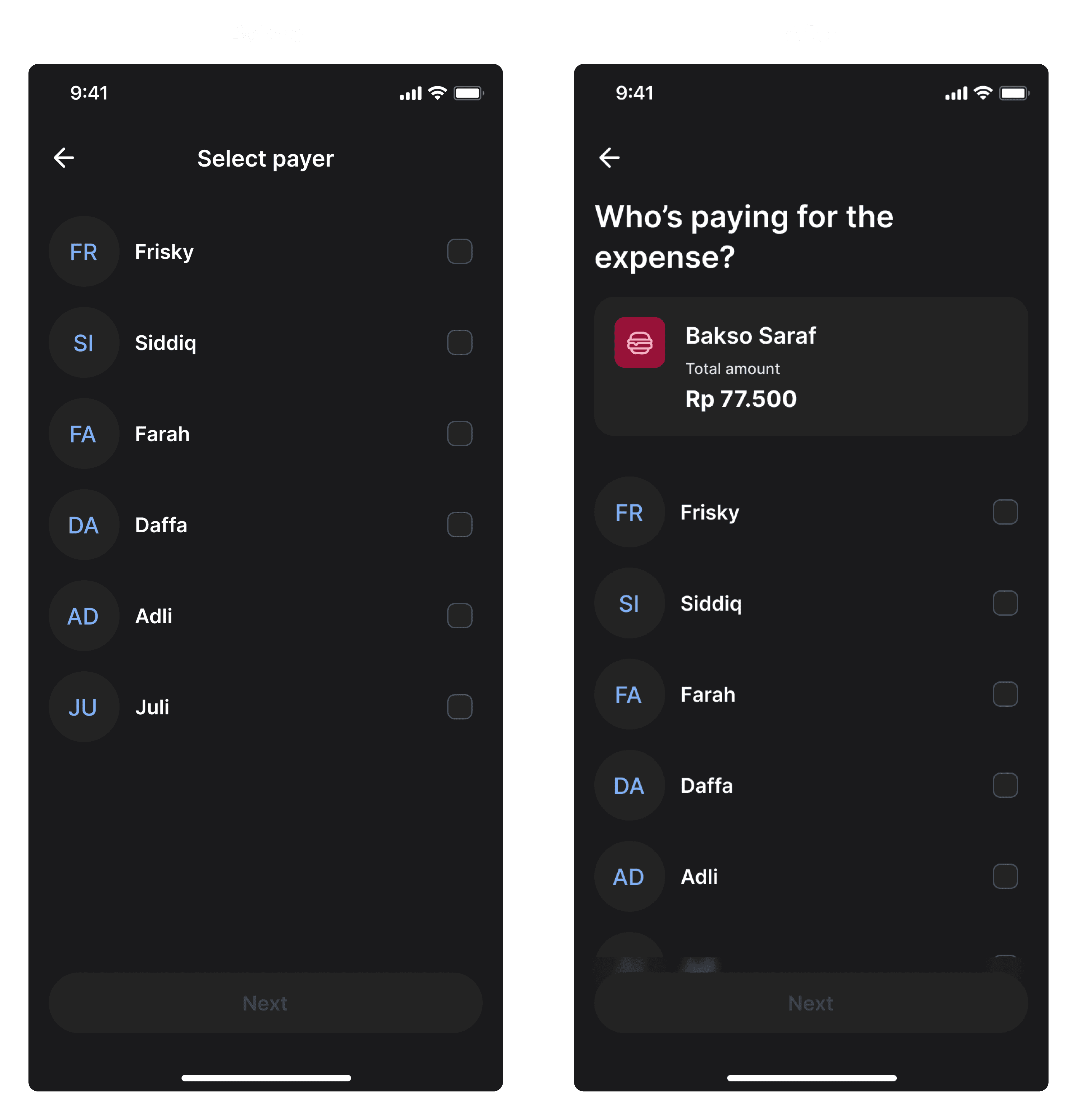
Fig. 16 - Before and After Comparison of the Header in the Select Payer Screen
To tackle this problem, we added the details of transaction name and the total of expense at Select Payer page.
Pattern Identification #5
2 out of 5 subjects commented that certain titles or labels didn't effectively convey the intended action, leading to confusion. This means that for some users, some labels or titles are hard to understand.
“After inputting expense there is menu called ‘Select Members’ which was confusing at beginning. We choose members for what?” - R, 25
“The term 'Select Members' in the top bar title can be changed to 'Select Participants' and/or 'Who are involved in this expense?" - H, 25
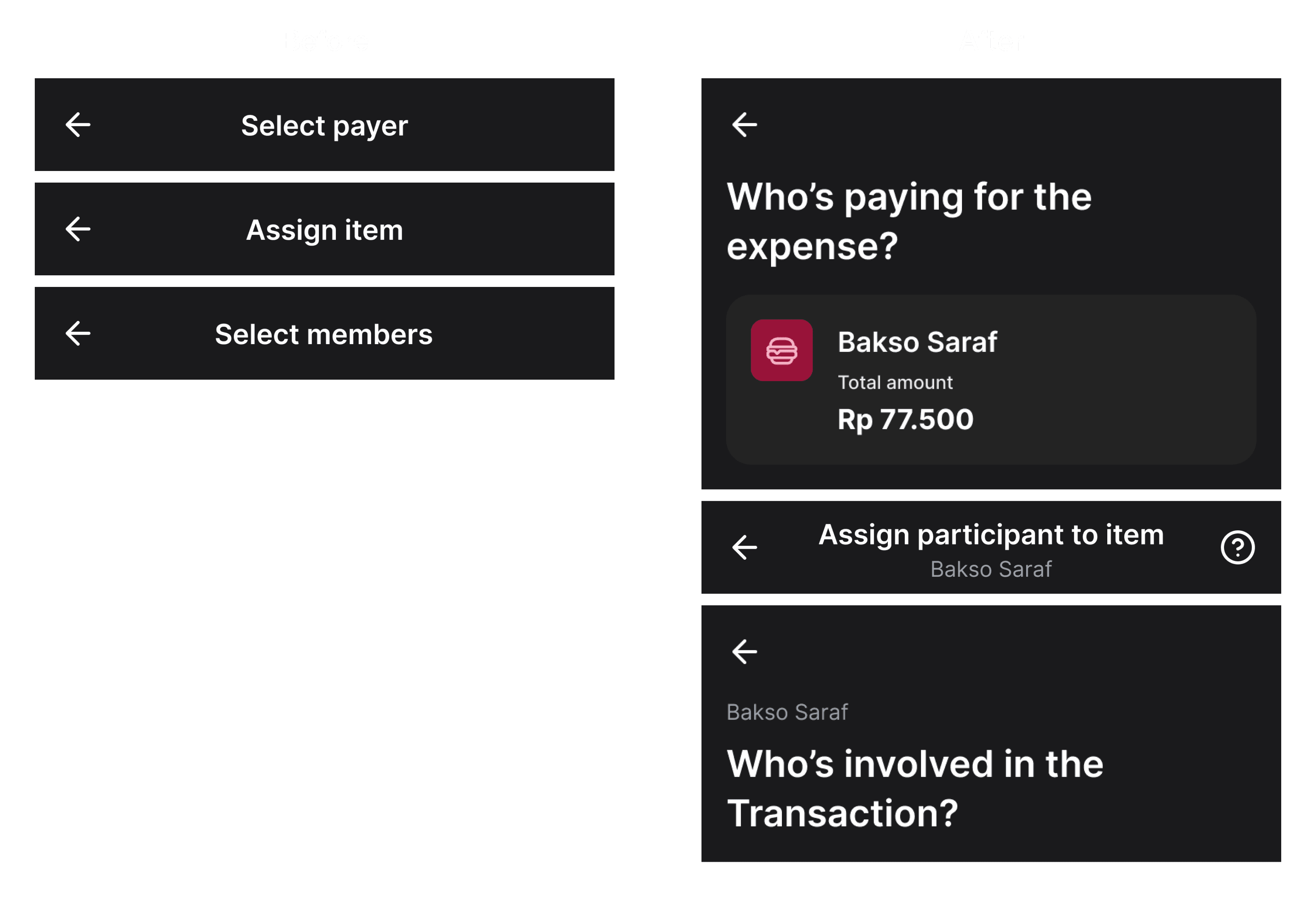
Fig. 17 - Before and After Comparison of Screen Headers
We found the label didn't explain the menu well or help users navigate. So, we changed it to something clearer, making sure users know what happens when they choose options.
Fig. 18 - After refinement
Key takeaways
User Involvement Drives Design
One key lesson was understanding the pivotal role of users in the design process. Actively engaging them in the process and incorporating their feedback ensures that our app authentically addresses their needs during trip expense management.
Intuitiveness is Key
The project emphasized the importance of making the app easy to use. A straightforward interface with clear visuals and simple navigation is key for users to adopt and enjoy the experience.
Discovering Root Issues with the 5 Whys
We discovered the effectiveness of the 5 Whys approach, borrowed from Toyota. By repeatedly asking "why," we uncovered the root causes of user problems. This method guided our design, addressing core issues more precisely.