Shaping User Behavior to Eliminate 80% Errors in Setlary's KYC Selfie Capture Process
Setlary improves employee financial well-being through its B2B Earned Wage Access (EWA) service, enabling users to access their salaries before payday to address urgent needs with daily pay. The KYC process, critical for secure transactions and unlocking key paid services, initially encountered an 80% error rate in the selfie-capturing step. This issue created bottlenecks and hindered conversion rates. Through targeted design adjustments, we resolved these errors. I took sole responsibility for developing and implementing the solution.
Year
2024
Role
UI/UX Design
The Initiative Background
The KYC process in our app is crucial for ensuring secure transactions and gaining valuable customer insights. Additionally, completing KYC is mandatory for users to access our key paid services. This process requires users to submit a photo of their ID card and a selfie, both of which undergo verification to unlock essential features. However, the selfie-capturing step presented significant challenges, with the Product Team reported that 80% of rejections were due to improperly captured photos.
These errors created a major bottleneck, negatively impacting KYC completion rates and overall conversion metrics. While some users successfully completed the KYC process, many others did not. This directly impacts conversion rates and affects transaction numbers for the company. Given the urgency of the situation, we could not afford to wait. The design solution was completed within a day, and the development team finished implementation in less than a week.
The Problem & Early Testing
The primary issue behind the rejections was improperly framed selfies, which arose from the design of the previous selfie capture frame. The capture area was designed to frame only the user’s face, while the third-party verifier required the photo to include both the face and the upper chest area. This discrepancy stemmed from the design being implemented in production before UI/UX designers were involved in the early stages. The layout of the capture frame failed to clearly communicate these requirements, leading most users to submit photos that captured only their faces.
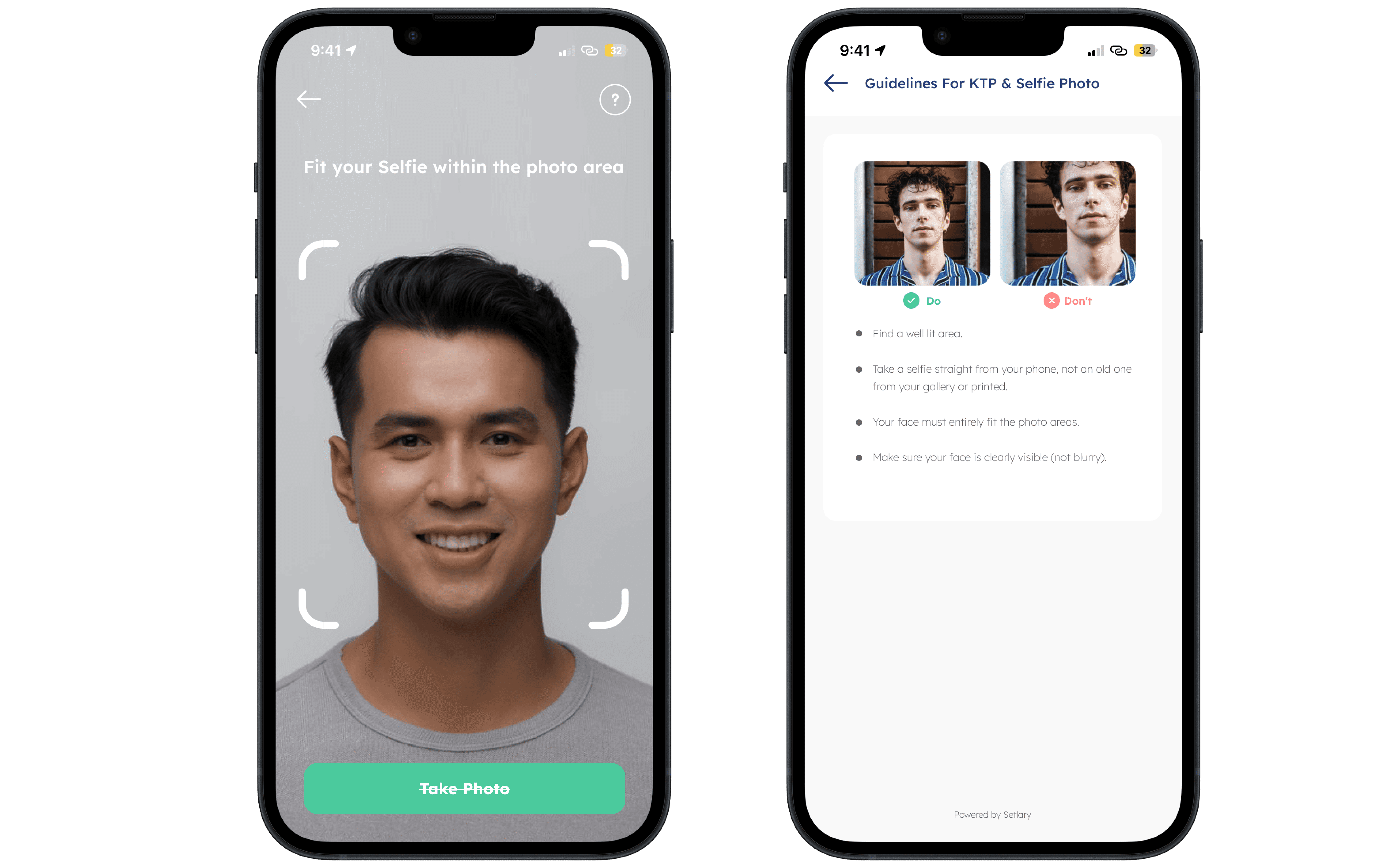
Fig. 1 - Previous Design of Selfie Capture and Selfie Guide
To delve deeper into the issue, we conducted an internal guerrilla test—a step that had not been taken prior to the involvement of UI/UX designers. Five participants were asked to demonstrate how they would take a selfie using the previous design. The results were unanimous: all participants focused solely on capturing their face within the frame, with some positioning their face to fill the frame completely. When questioned, they pointed to the app’s instructions, which explicitly directed them to do so. Moreover, the test revealed that the existing Selfie Guide provided insufficient clarity on how to achieve the required result, further exacerbating the problem.
The testing findings matched the data from our tracking tool, confirming that many users framed only their faces within the capture area. Additionally, inconsistencies in user submissions revealed another challenge—while some users focused solely on their faces, others included a slightly broader portion of their upper body.
Through further analysis, we discovered that the style of selfies also varied significantly. Some users took the photo at an angle, while others captured it from above or below. This lack of consistency and clarity in the design played a significant role in the high rate of verification rejections, as our third-party verifier required properly aligned and framed selfies to approve submissions.
All the issues mentioned above were identified as particularly frustrating for users, as highlighted by complaints reported by the Product Team. According to our tracking tool data, many users had to attempt the selfie capture multiple times before finally being successfully verified. This repeated failure not only led to delays but also created a sense of discouragement. Without an intuitive and clear design, users were left feeling desperate, as the process of achieving verification became unnecessarily complex and time-consuming. The lack of clear instructions and visual guidance resulted in users feeling uncertain about how to meet the verification standards, leading to a cycle of trial and error that could have been avoided with a more thoughtful and user-centered design..
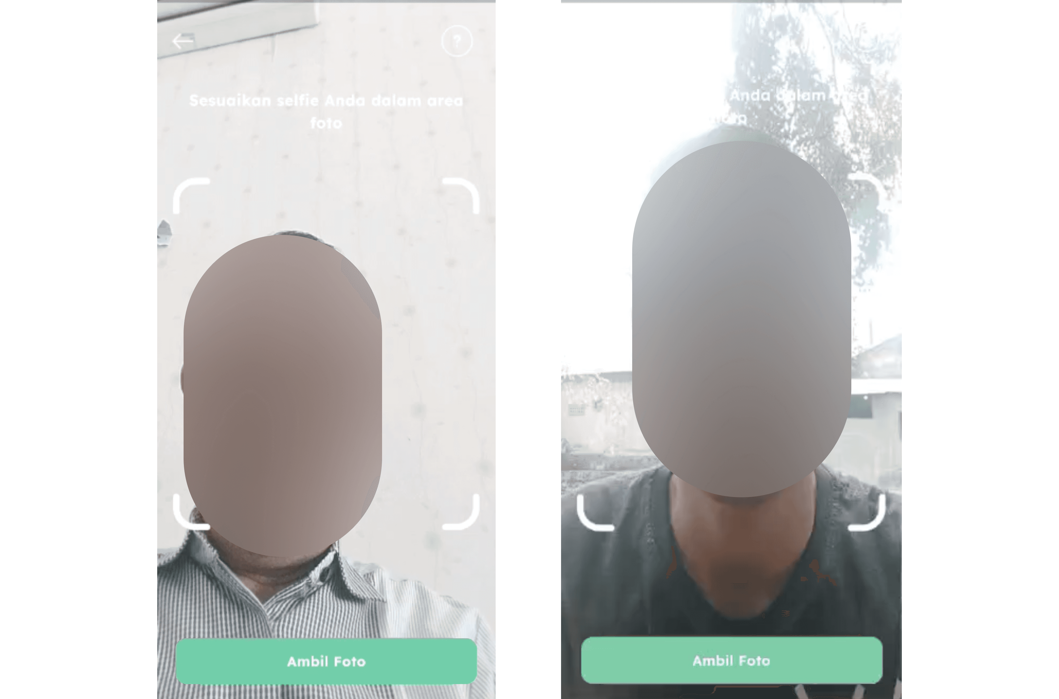
Fig. 2 - Insights into User Behavior During the Selfie-Taking Process
Solutions Statement
To tackle this issue effectively, we required a thoughtful and user-focused solution. We believed that the previous design, which featured a wide rectangular frame, caused confusion about how much of the capture area needed to be included and how the selfie should be taken to meet the required standards. This ambiguity resulted in inconsistent submissions and a high rate of rejections. Our objective was to develop a design that would seamlessly guide users to capture an accurate and acceptable photo, meeting both usability principles and the technical criteria of the third-party verification system.
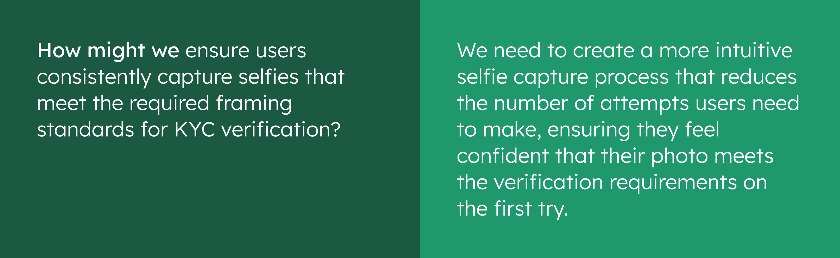
Fig. 3 - How Might We Statement
Design Exploration
Initially, I explored the idea of incorporating an overlay to clearly define the required photo area, which extended from the upper chest to the top of the head. This overlay was designed to serve as a visual guide, helping users understand both what needed to be captured and how to take an acceptable selfie for submission. However, during early exploration, I noticed a key drawback: the overlay partially obscured the user’s face on the screen. This not only made alignment more challenging but also risked confusing users, as they couldn’t clearly see how their face fit within the frame. These limitations indicated that the overlay approach might inadvertently lead to more inaccurate photo submissions, rather than resolving the problem.
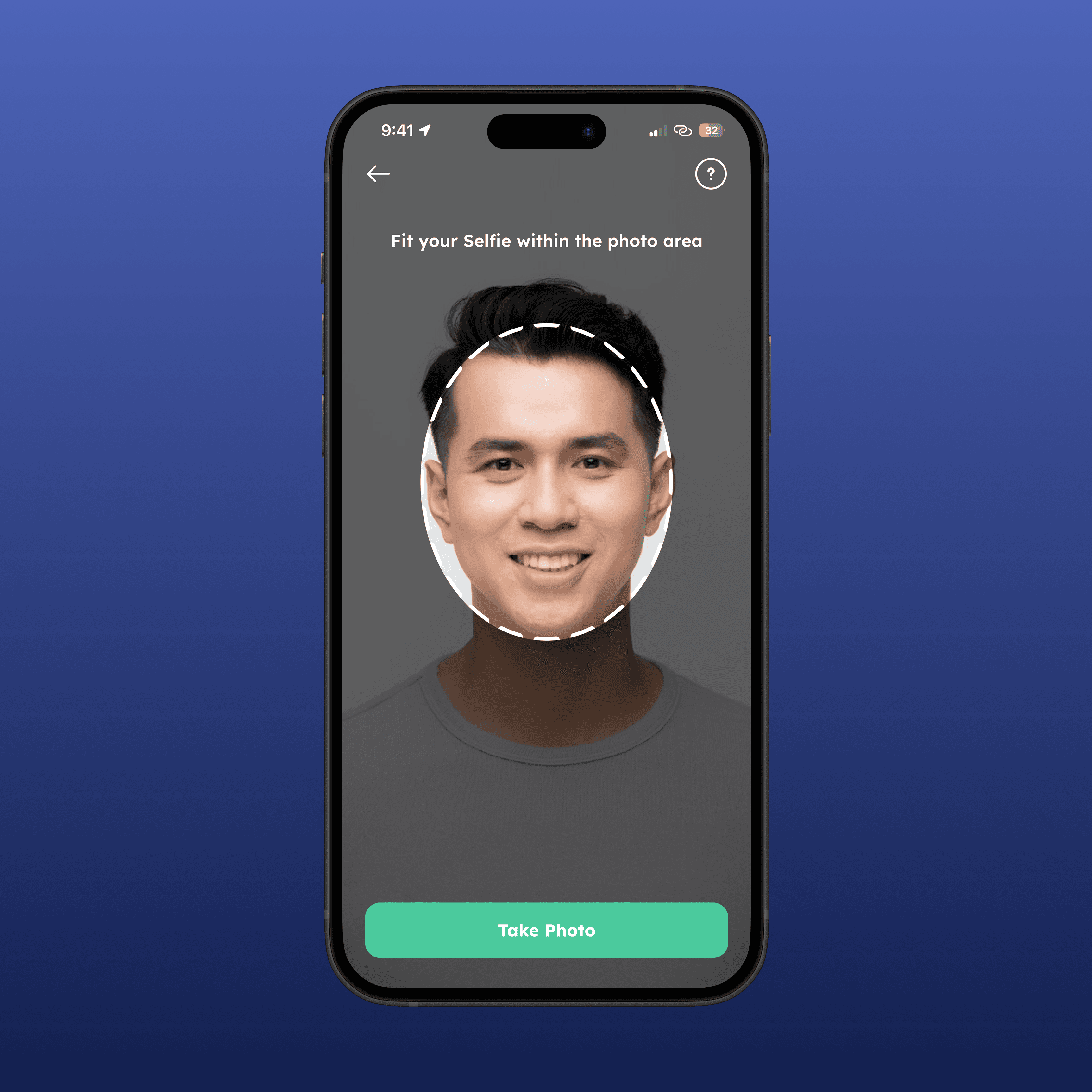
Shaping User Behavior with an Oval Frame and Dark Overlay: Why?
To solve this, I opted for an oval frame placed at the center of the screen. The decision to use an oval frame and overlay was intentional for several reasons:
Natural Fit for the Human Face
The oval shape closely resembles the contour of a human face, making it intuitive for users to align themselves within the frame. This natural alignment minimizes confusion and encourages users to follow the intended guidelines without requiring additional instructions.Focus and Simplicity
The oval frame directs the user's attention to the area that needs to be captured while avoiding unnecessary distractions. Unlike a rectangular frame, which can seem overly broad or vague, the oval shape provides a clear boundary for alignment.Enhanced Focus and Reduced Distractions
The dark overlay surrounding the oval frame helps isolate the area to be captured, minimizing background distractions and ensuring that users focus solely on positioning their face within the frame. This visual cue reinforces the intended photo area, making the process smoother and reducing the chances of incorrect submissions.
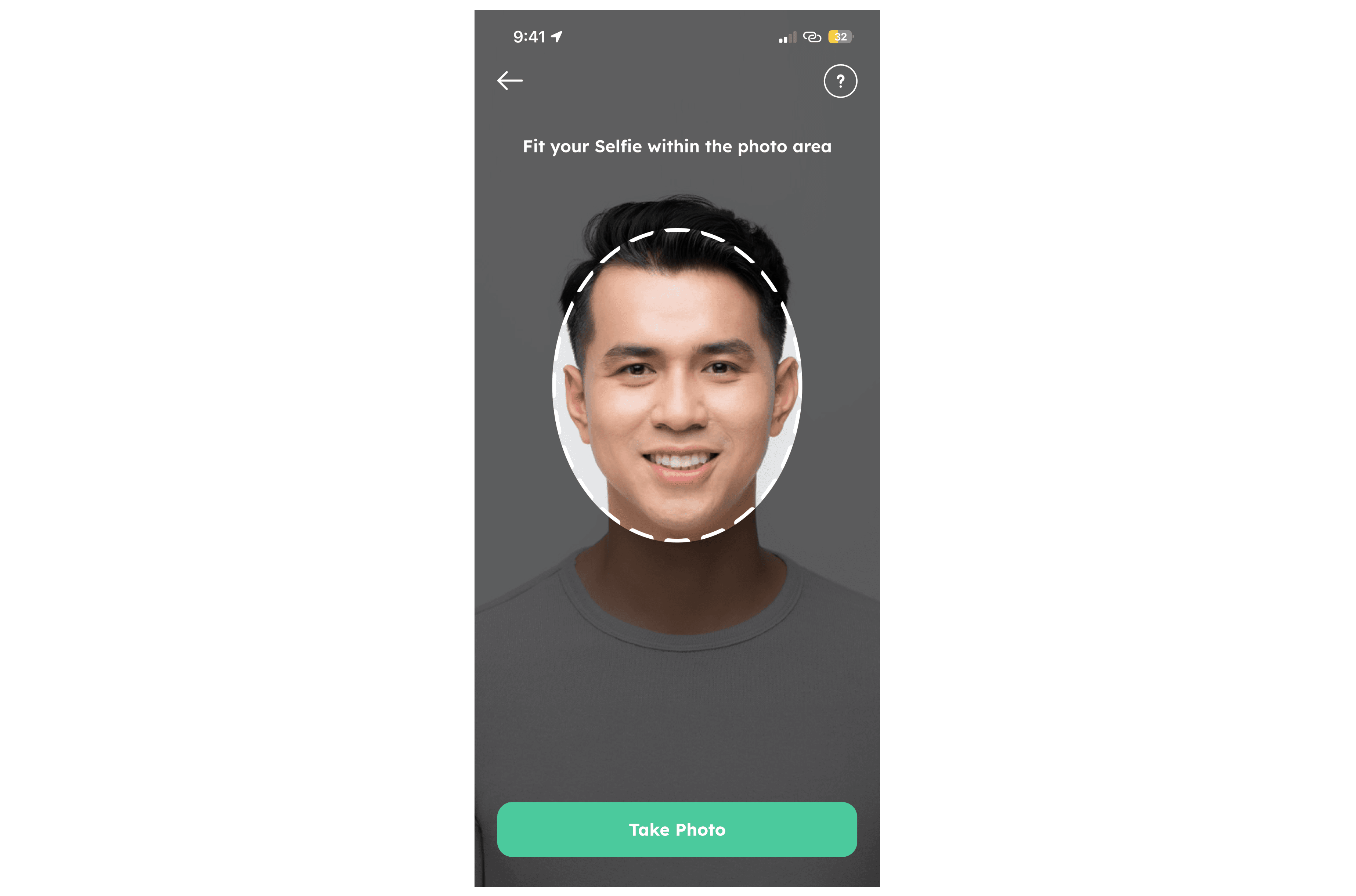
Fig. 4 - The Oval Frame and Dark Overlay
Collaborative Iteration with Devs
After discussing the concept with the IT team, we collectively decided to incorporate the oval frame as the central visual element. To ensure the frame also captured the upper chest as required, the IT team adjusted the photo capture radius to include a larger area than the visible frame. This subtle technical adjustment ensured all necessary details were captured without confusing users.
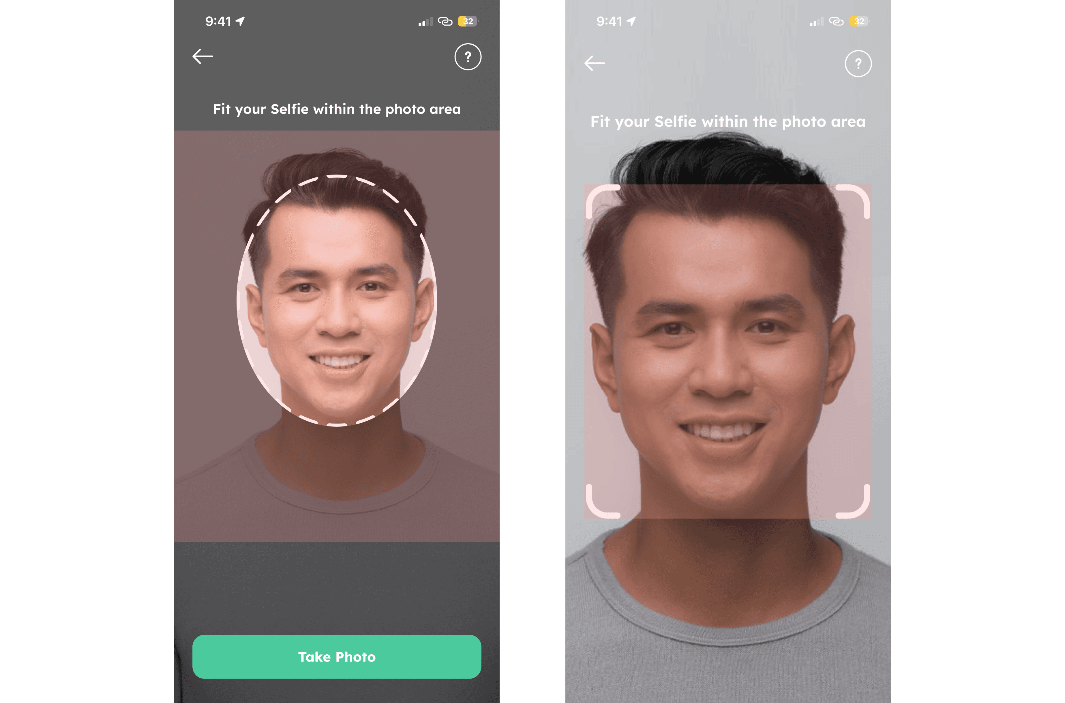
Fig. 5 - New Capture Radius (Left) vs. Old Capture Radius (Right), Marked in Red Overlay
Adjusting the Guide
We also adjusted our guide to better explain the intended result. We made slight revisions to the copy and incorporated the new oval frame into the "Do" and "Don't" images, which previously did not include the frame area.
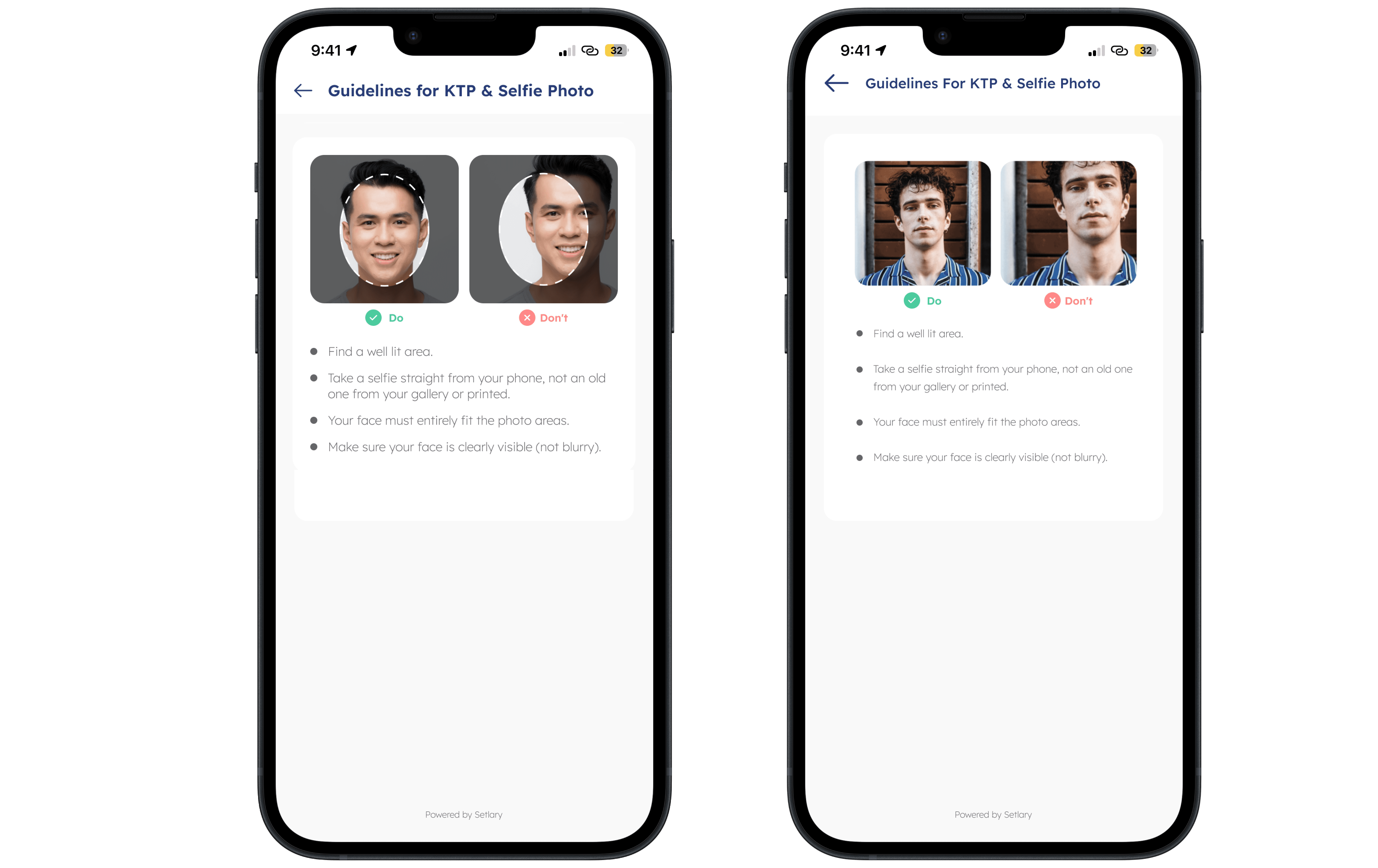
Fig. 6 - Adjusted Guide Page (Left) vs. The Existing (Right)
Validation and Testing
After finalizing the design, we conducted an internal guerrilla test to validate its effectiveness. Participants were asked to take a selfie using the new design. The results were clear: all participants instinctively positioned their faces within the oval frame, achieving the intended composition. This confirmed that the design successfully guided users to capture accurate photos.
Final Implementation & Result
Fig. 7 - Final Design
With the positive testing results, we finalized the design for implementation. By switching to an oval frame and making targeted technical adjustments, we significantly reduced user errors and improved the KYC experience. Users now follow the oval frame, positioning their face within it, which encourages a straight, aligned selfie. The oval frame not only resolved the inconsistency issues but also enhanced usability, creating a seamless and intuitive process for users. After implementing this solution, the Product Team reported no rejection issue related to improperly framed photos.
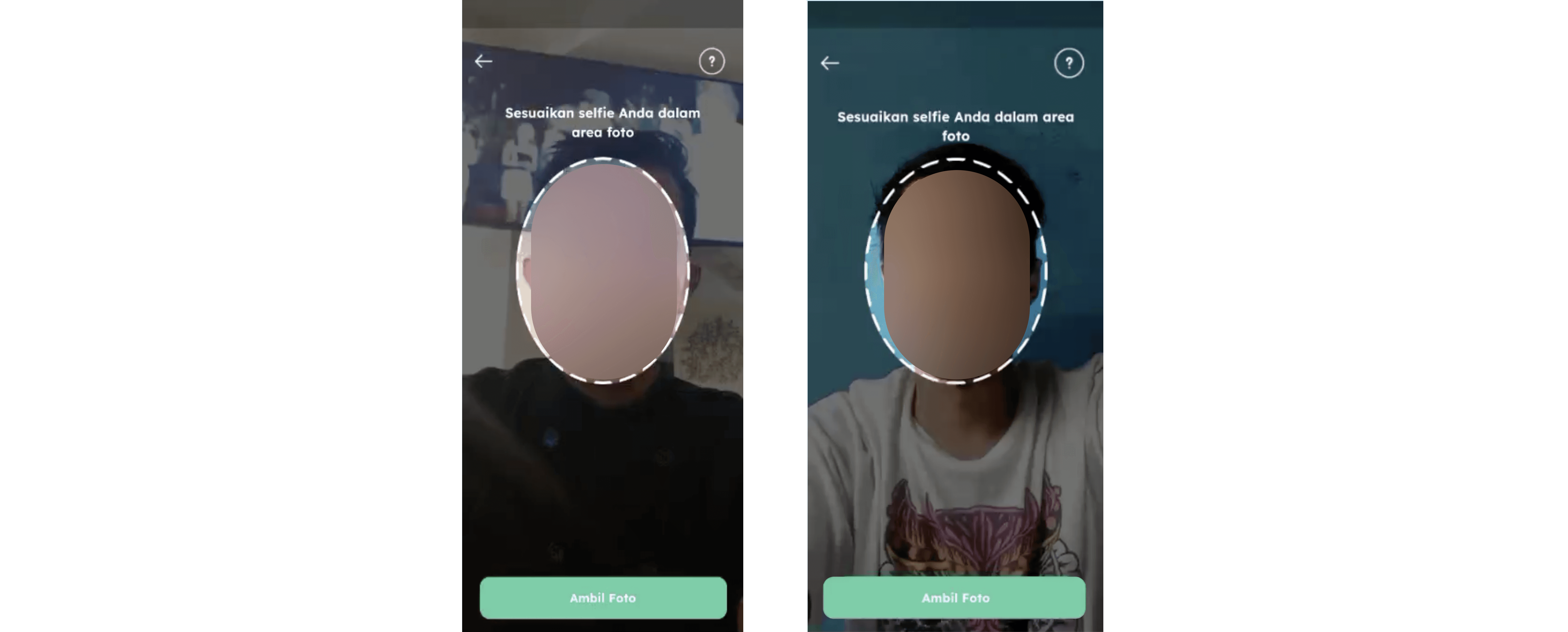
Fig. 8 - Behavioral Impact of the New Design
What's Next
We’ve planned a complete KYC revamp to enhance conversions by creating a more intuitive and engaging process. The redesigned approach breaks the process into clear, step-by-step stages, incorporates a liveliness system and data validation checks during submission. These checks allow us to notify users of any discrepancies before their information is sent to the third-party verifier. Additionally, we’ve introduced prompts to emphasize the benefits of completing the KYC process during user interactions. Early research indicates this strategy could significantly boost conversion rates. The plan is already in the development cycle backlog.