Redesigning the Setlary's Daily Auto Salary Cash-Out Experience
Setlary enhances employee financial well-being through its B2B Earned Wage Access (EWA) service, allowing users to access a portion of their salary before payday to meet urgent financial needs. One key feature, Daily Auto Cash-Out (DAC), enables users to automatically receive their prorated daily wages. However, following its deployment, the feature underperformed. Through a series of user research initiatives, we uncovered critical issues related to user experience and comprehension. After redesigning the overall experience, we successfully increased Daily Auto Cash-Out transactions by 42.86%.
Year
2024
Role
UI/UX Designer
The background
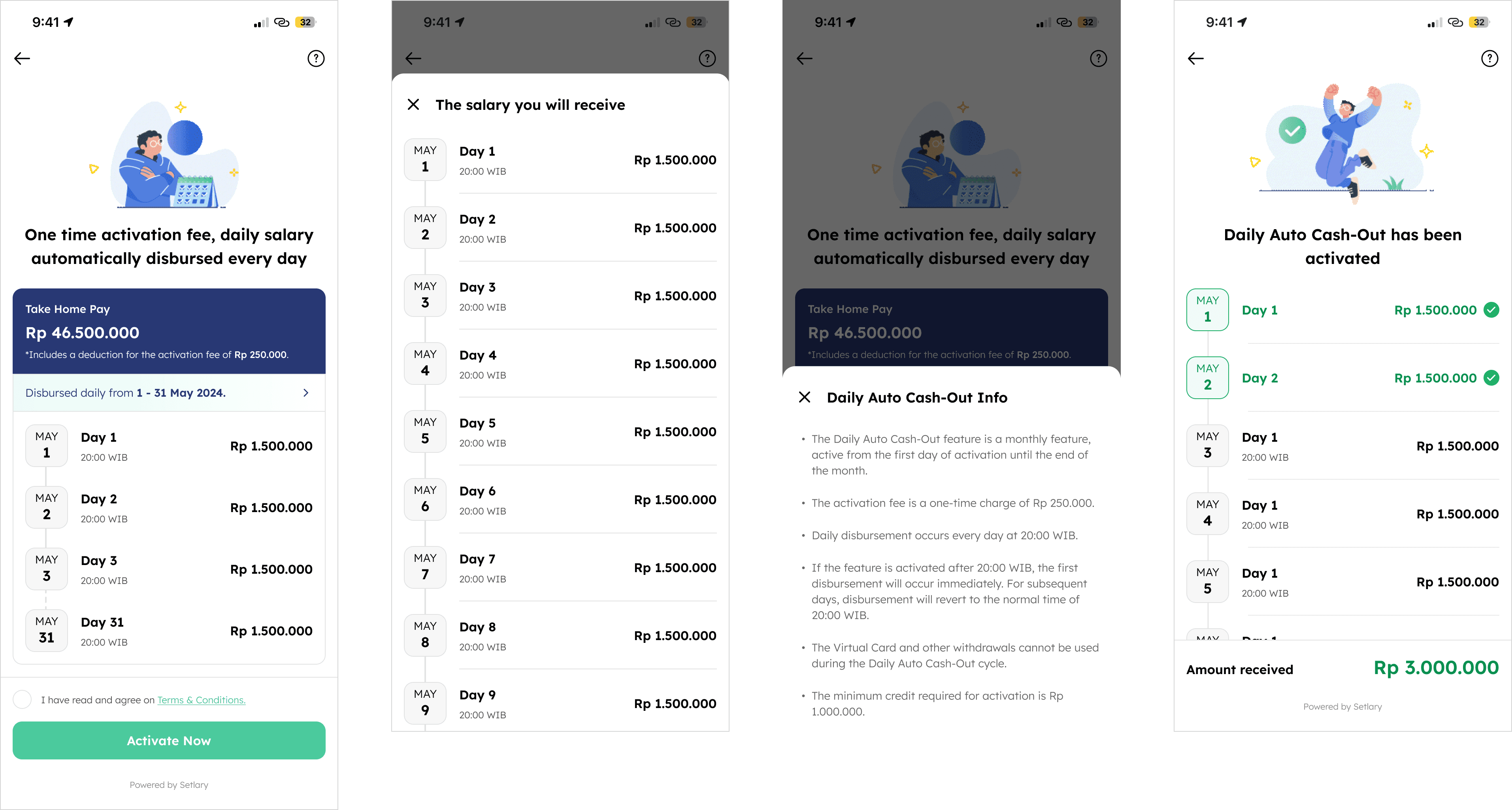
Daily Auto Cash-Out (DAC) is a feature that allows users to automatically receive their prorated daily salary from the day of activation until the end of the current month. Once activated, users will receive their salary every day at 8 AM (or 20:00 Western Indonesia Time), with funds automatically transferred to their bank account. A transaction history will also be provided. Users are charged a one-time fee upon activation, which is automatically deducted from their salary. This feature cannot be canceled once enabled.
By receiving their salary daily, users no longer need to wait until payday, making it easier to manage daily expenses, cover urgent needs, and avoid reliance on high-interest loans or credit. This consistent cash flow provides financial stability, helping users budget more effectively and reduce financial stress.
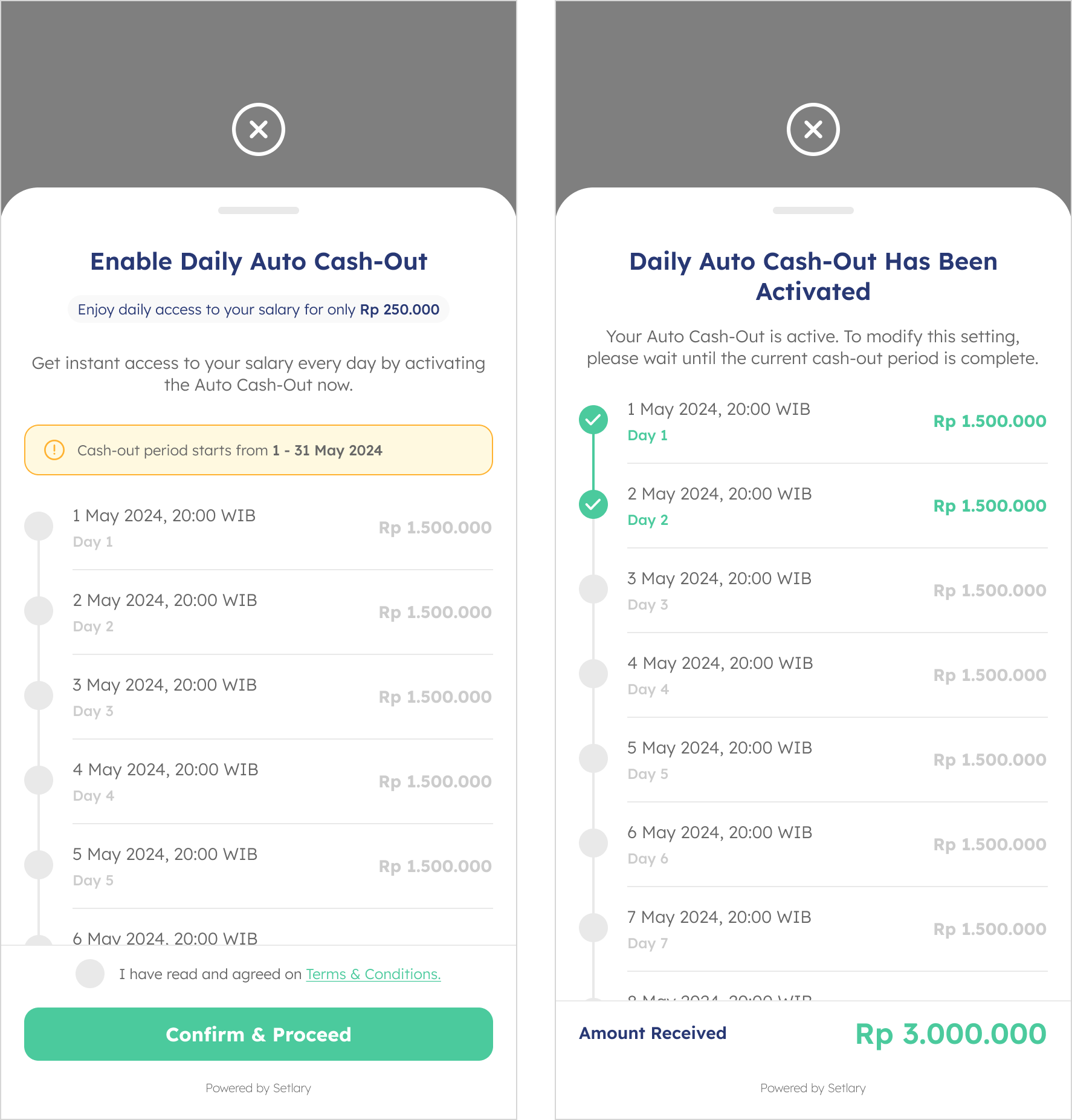
Fig. 1 - Existing DAC screen, before activating DAC (left) and after activating (right).
Problem
The Daily Auto Cash-Out (DAC) feature, introduced by Setlary, enables users to receive their prorated daily salary without having to wait until payday. This feature was already deployed before I joined the company. However, it has shown underwhelming performance due to a low number of activations. As a result, the task of improving DAC engagement was assigned to the Design Team, and I was appointed to lead the project.

Fig. 2 - The process.
Guerrilla Testing
We conducted user research with the goal of identifying issues in our interface and overall user experience. To achieve this, we invited five participants to take part in Guerrilla Testing sessions, observing how they naturally interacted with our app.
Guerrilla Testing was chosen for its speed and practicality at that time. It enabled us to quickly gather real, unfiltered feedback without the need for a formal lab setting. This method is particularly effective in early-stage design iterations, helping us uncover usability issues and pain points directly from potential users in their everyday environments.
Following the sessions, we discovered that the primary issues lay in the information presented on the DAC page. Participants struggled to understand what the feature does and why it might be beneficial to them. The fee structure was also unclear—users couldn’t confidently explain how the fee worked, leading to confusion and hesitation. Moreover, many found it difficult to determine the total salary they would receive, which made the overall experience feel unintuitive and lacking clarity.
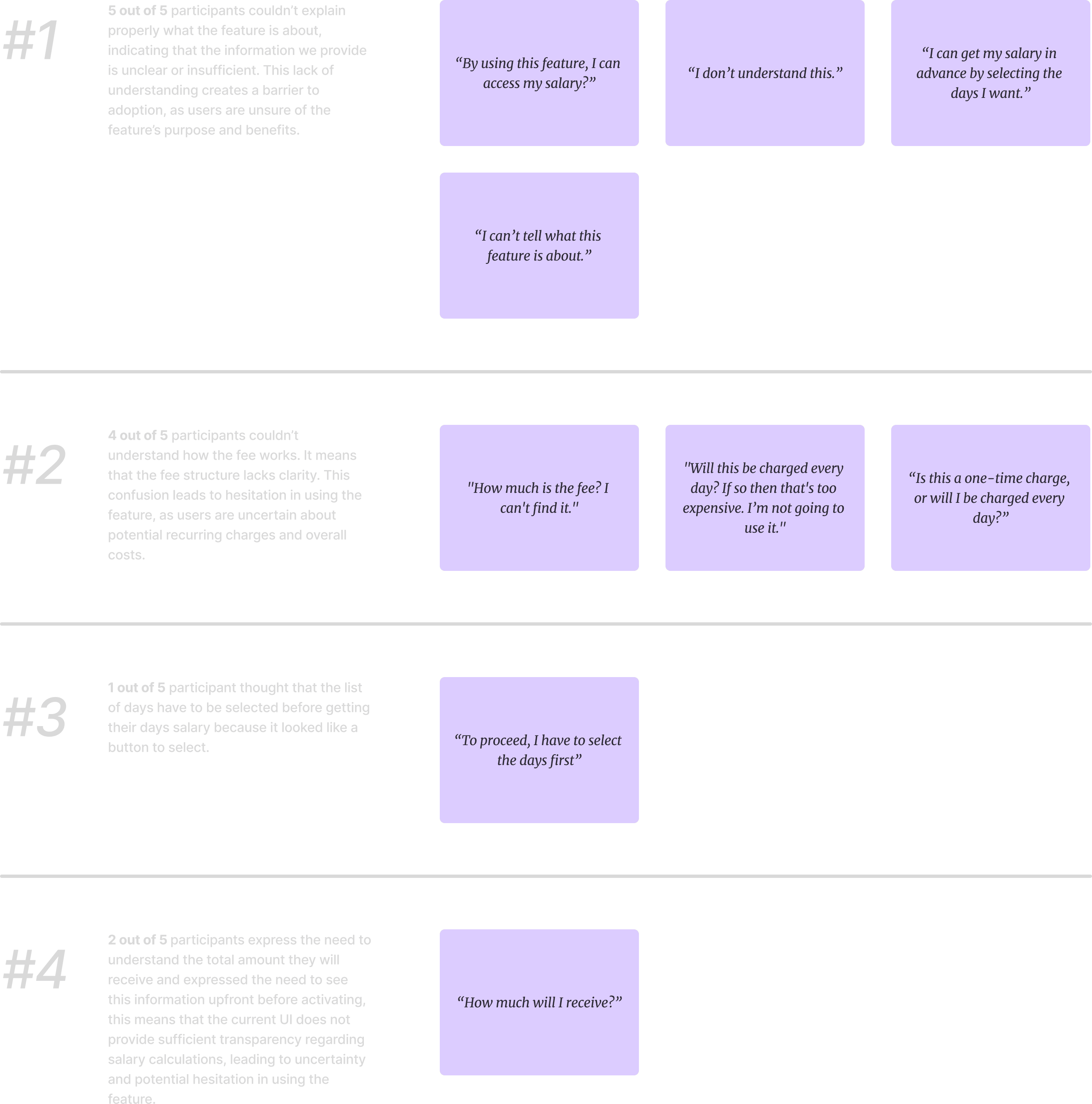
Fig. 3 - Guerrilla Testing result.
User Interviews
We conducted user interviews with 10 participants to gain deeper insights into their behaviors, needs, goals, and pain points when engaging with financial products. As the company’s first qualitative research effort, these interviews provided valuable insights that further fueled our design decisions. Through this process, we identified two distinct user groups.
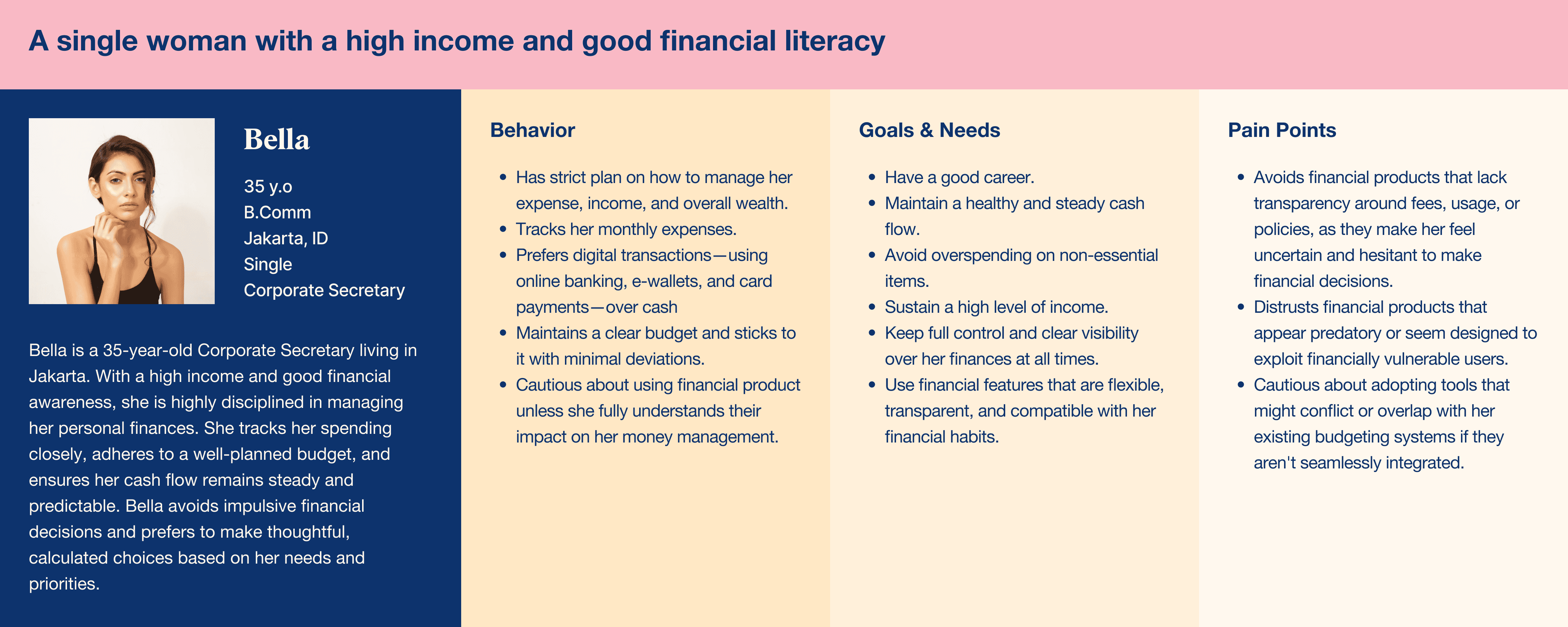

Fig. 4 - User Personas.
From our user interviews, we discovered that users generally aim to maintain control over their finances, ensure their daily needs are consistently met, and feel confident when making financial decisions. However, many face recurring pain points that hinder this. Common challenges include a lack of transparency around fees and policies, complex terms and conditions, and financial tools that feel overwhelming or predatory. Users often feel hesitant or unsure when instructions are unclear or when procedures feel unnecessarily complicated. There is also concern about whether a new financial tool will align with their current budgeting habits. Across the board, users expressed a strong need for clarity, simplicity, and trustworthiness to feel secure and supported in their financial choices.
How Might We
After gaining insights into users' problems, I defined and discussed them with my design team, product team and marketing team, and the redesign revolved on the following topics:
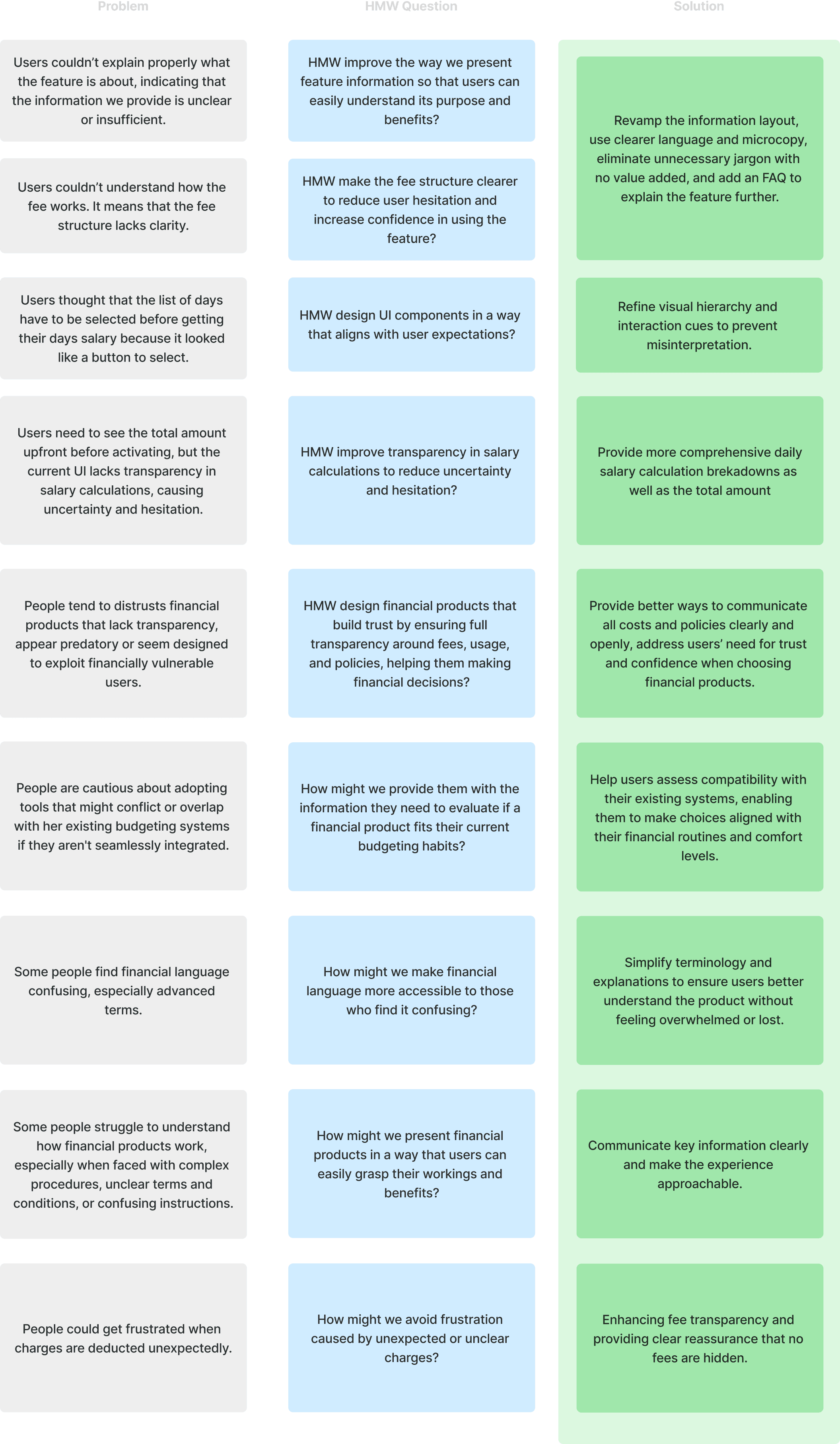
Fig. 5 - How Might We
Redesign Goal
The goal of this redesign is to ensure users clearly understand the Daily Auto Cash-Out feature, making it more intuitive and user-friendly to encourage adoption and increase conversions. Research findings revealed that confusion often arises when users first encounter the feature page—particularly before activation—due to unclear explanations about how the feature works, its benefits, and the associated fees. Interviews further highlighted that users have a strong need for clarity, simplicity, and trustworthiness to feel confident in their financial decisions. By addressing these pain points, the redesign aims to streamline the user journey, enhance understanding, and ultimately drive greater engagement and conversion.

Fig. 6 - DAC's user journey, the impacted area marked in red.
Redesign Strategy
With those solutions in mind, I moved forward with the design process—creating sketches, refining concepts, and incorporating insights from the marketing and product teams to better position the feature. I then developed a high-fidelity design and an interactive prototype to test with users, ensuring the solution effectively addressed their needs.
The Improvement
My goal was to present essential information clearly on the DAC landing screen, as this is the first page users see when opening the Daily Auto Cash-Out (DAC) feature. Ensuring users fully understand how the feature works was a top priority.
The first change I made was moving from a bottom sheet to a dedicated page for DAC. This decision was driven by the need for a structured and scalable layout, ensuring that all key information—such as how DAC works, the fee structure, and the total amount breakdown—could be displayed more effectively. A dedicated page allows for better content organization. With a full page, users can also scan information more easily, interact with content without space constraints.
I focused on revamping the information layout, emphasizing four key points:
How Daily Auto Cash-Out Works – We introduced clearer explanations through a combination of animations, microcopy, and improved visual hierarchy. This marks a significant improvement, as this information was entirely missing in the previous design.
Fee Structure Explanation – Clearly stated whether it’s a one-time charge, making it prominent and easy to grasp.
Complete Salary Breakdown – Displayed the total amount users will receive, while still maintain a detailed per-day breakdown.
Refining Copy & Reducing Jargon – Simplified language and opted for clearer wording to ensure users quickly understand the feature for making informed financial decision, collaborating closely with the Marketing team.
UI Usability Improvement – Identified and resolved a usability issue where user mistakenly believed they needed to select specific days due to a design resembling radio buttons. Replaced it with a calendar-like card component, making the month and days more intuitive and visually distinct.
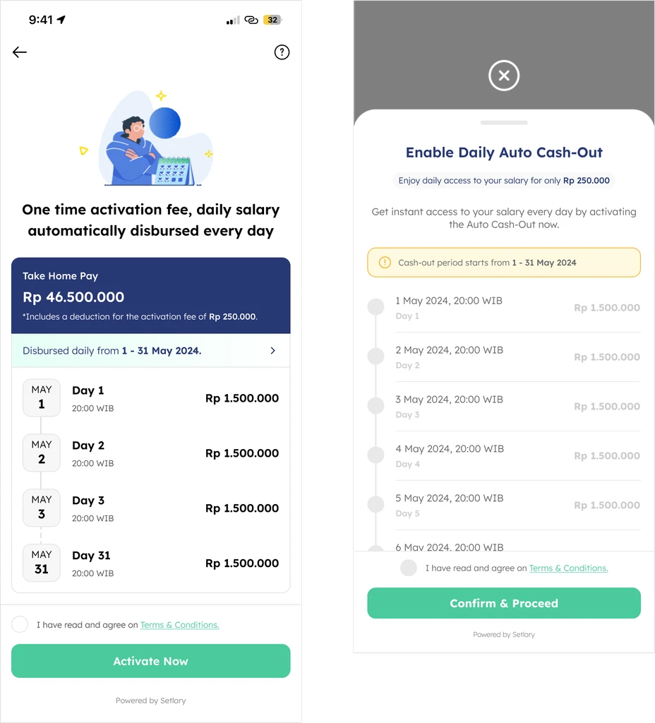
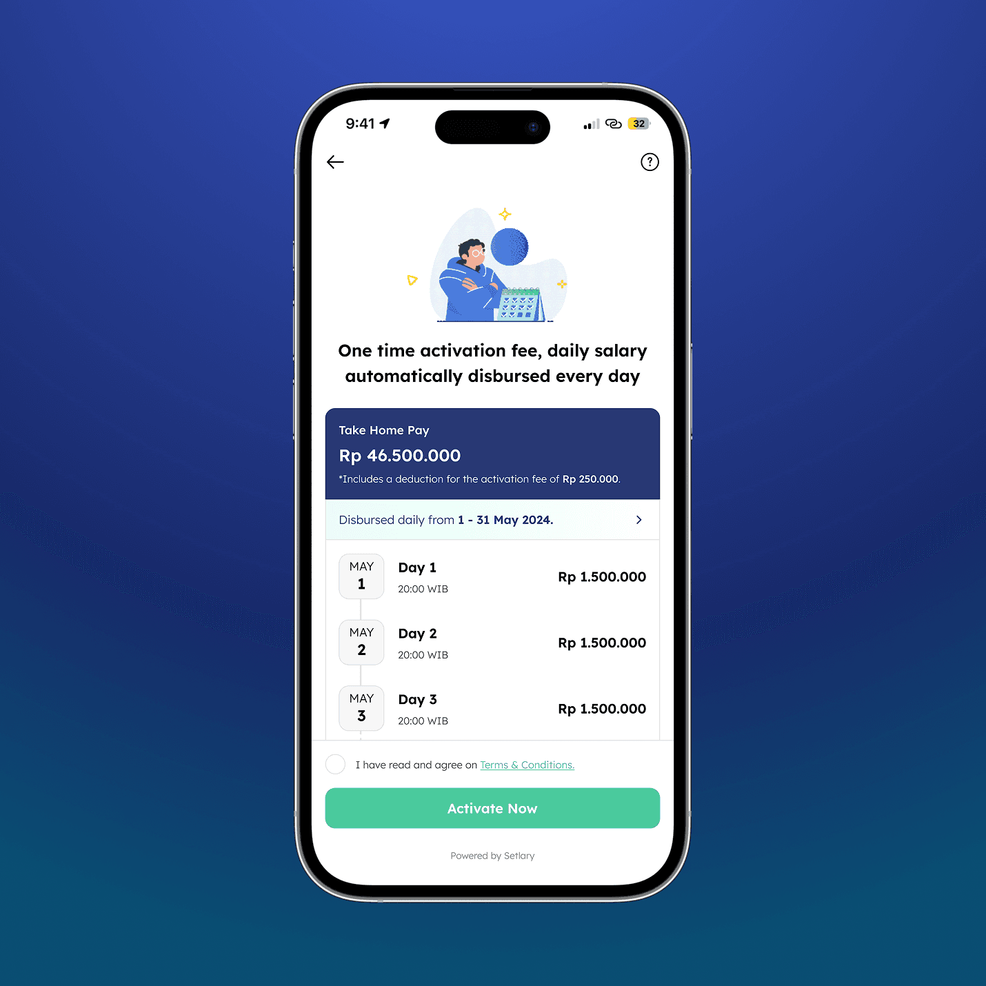
Fig. 7 - New DAC landing page (left) vs the existing (right)
Another improvement I made was moving the detailed daily salary breakdown into a bottom sheet, keeping only the overview visible on the homepage. This declutters the main screen, allowing users to focus on critical information first—such as the total amount received and the fee structure—without feeling overwhelmed. By prioritizing high-impact content, users can quickly grasp essential details while still having the option to explore secondary information when needed.
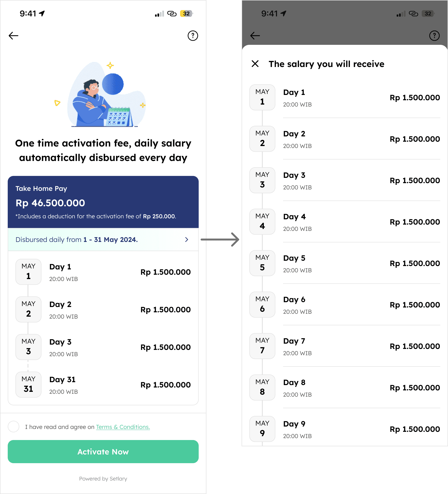
Fig. 8 - Daily salary breakdown
For the post-activation screen, we didn't change much. We continue using existing pattern as there's no issue, just couple on changes to make it in line with the new proposed UI.
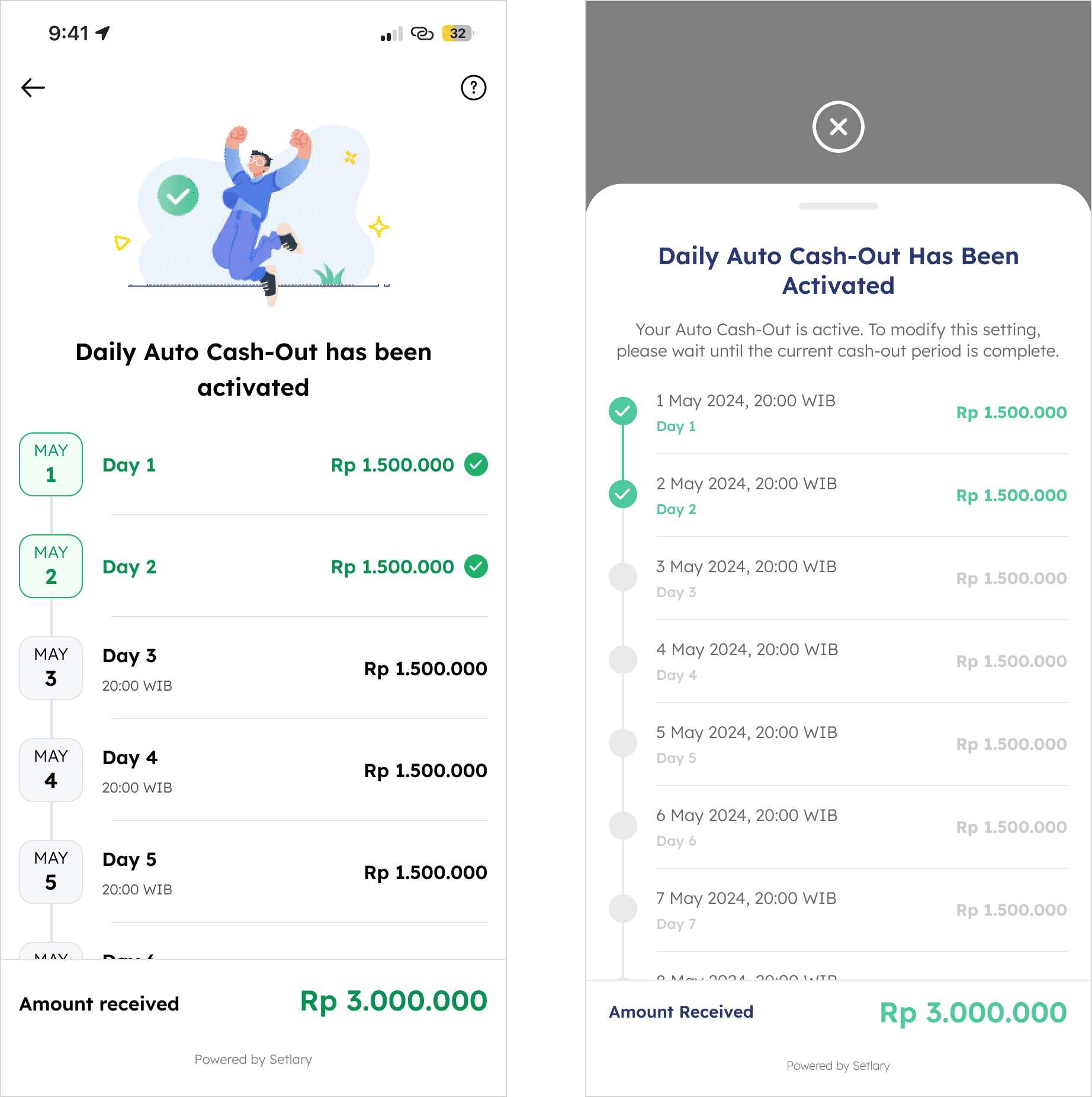
Fig. 9 - New post-activation screen (left) vs the existing (right)
We also added new information screens to further explain how the DAC works, as this type of information wasn’t stated anywhere before."
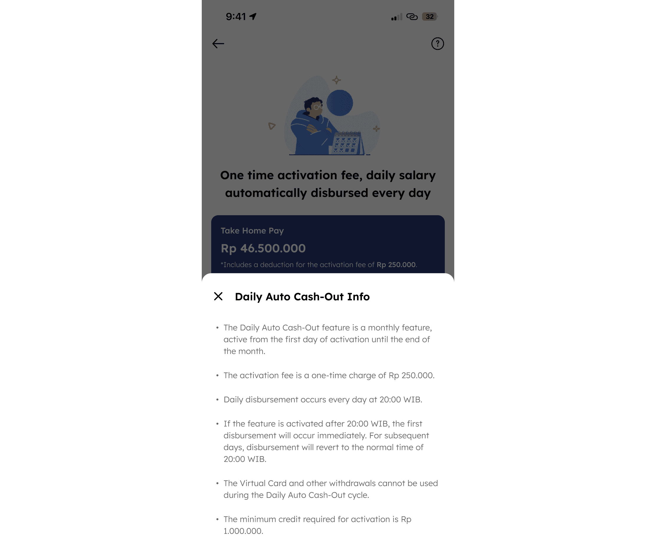
Fig. 10 - DAC information screen
Redesign Result
After completing the prototype, I conducted Guerrilla Testing with 5 potential users to observe their interactions and gather feedback—focusing on issues identified earlier in the design process. The results were encouraging: participants quickly understood how the feature works, far better than with the previous design. They also shared that the redesign made it easier to grasp the value and mechanics of the feature, increasing their confidence in making informed financial decisions.
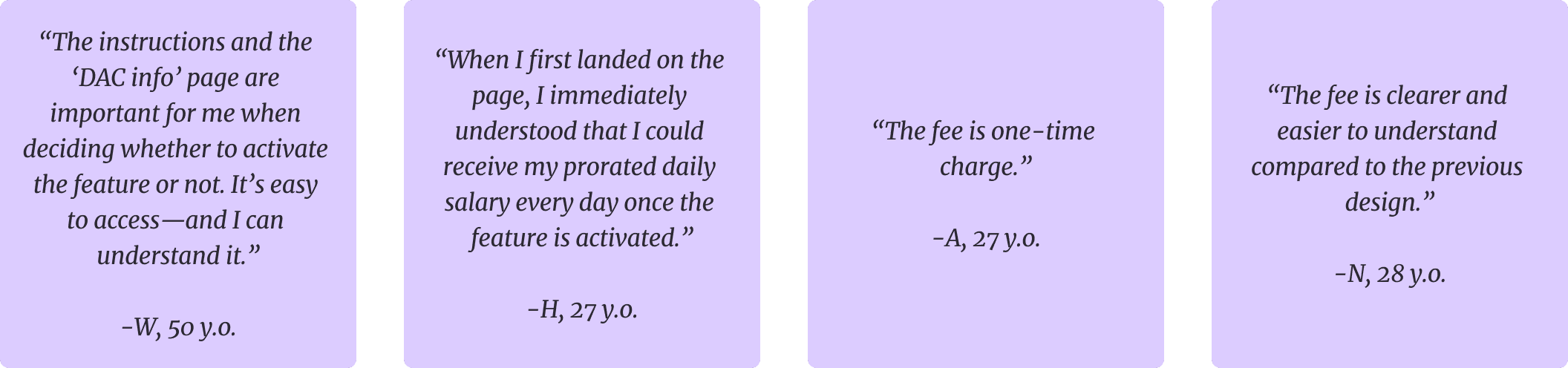
Fig. 10 - Quotes from Guerrilla Testing.
After deployment, we discovered an increase on adoption. We achieved a 42.86% increase in Daily Auto Cash-Out activation.