The Rationale Behind Redesign Decisions of School Parent App
This app is designed for parents of kindergarten kids. It provides them with essential information such as a calendar, payments, check out request (when parent arrives to school and request his kid from the app), daily activities (activity feed), chat (school - parent conversations). As a UI Designer, I was responsible to redesign the app based on the requirement provided by my client. Here I unveiled what I did in this redesigning project.
Year
2022
Role
UI Designer
The project background
My client approached me to help improve the UI. The app was functional at that time, but he felt like the app wasn’t visually appealing. They provided me with screenshots of the app that needed to be redesigned. He also asked me to design a tablet version.
The scope
My client wanted to have the following pages to be redesigned:
Home Page
Activity Calendar Page
Chat Room Page
Feeds Page
Log In Page
Profile Settings Page
Check Out Request Sent Page
Analyzing the current design
First, I had to analyze the app based on the screenshots provided by my client. Upon closer examination, I identified areas for improvement:
Enhancing the current home page
Refining the color scheme
Addressing inconsistent spacing
Replacing the current icons with ones that are more representative and share a similar style.
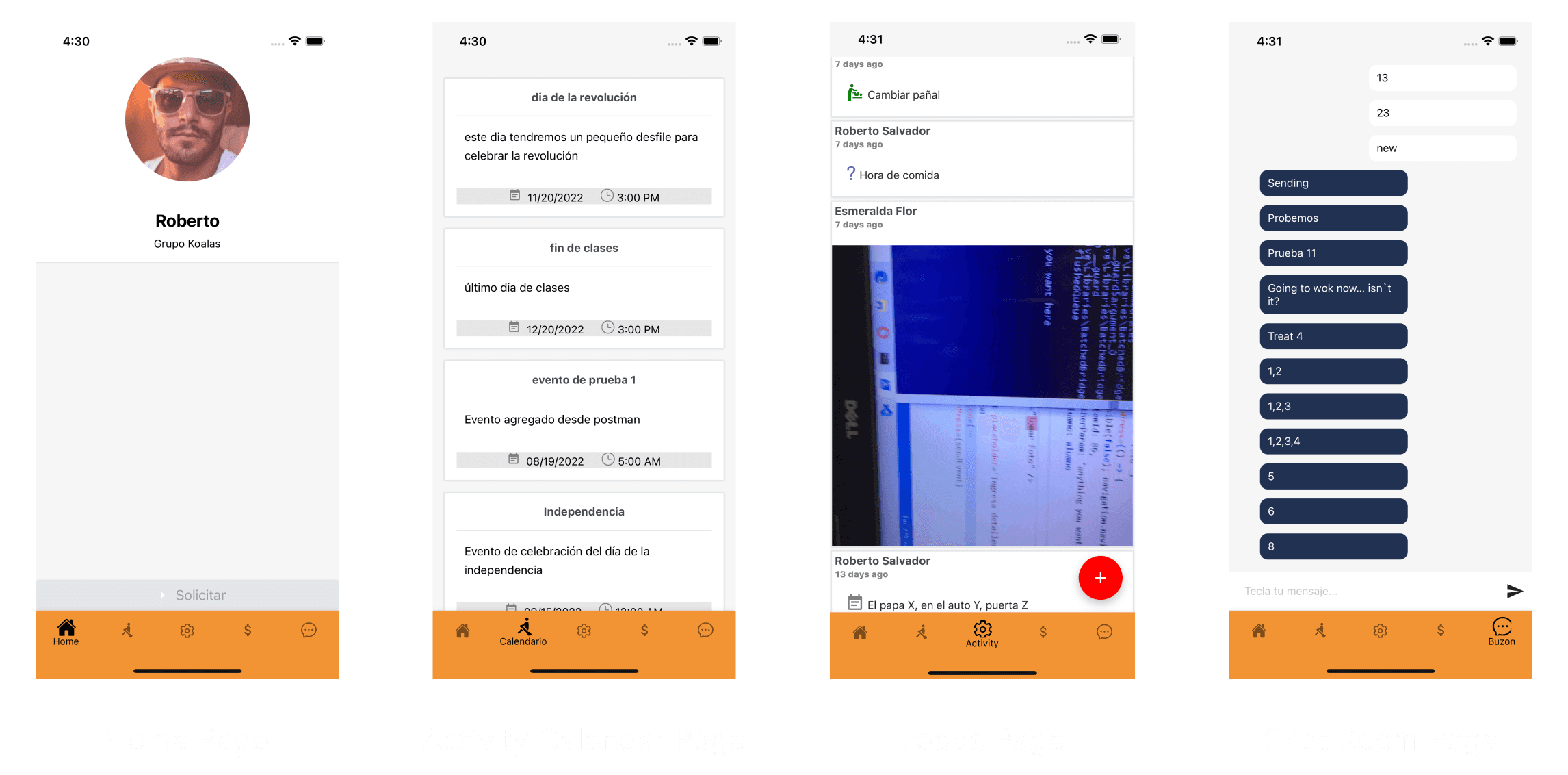
Fig. 1 - Screenshots of the Current App
Enhancing the Current Home Page
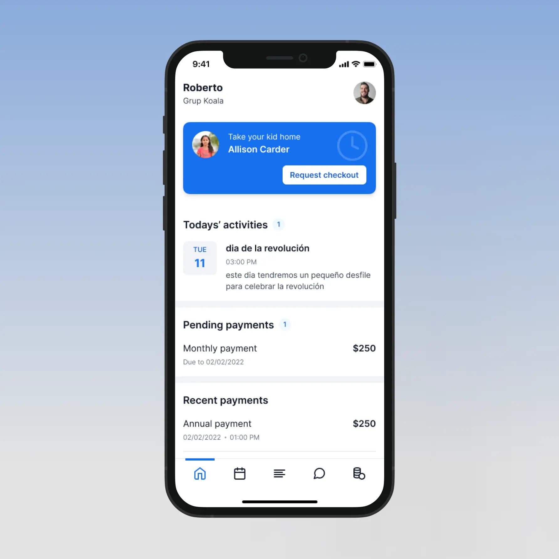
The old home page felt quite bare, with only user information on display. Given that the homepage serves as the starting point of the user journey and also acts as a summary of the information users might want to see or know, I introduced several crucial content sections: Today’s Activities, Pending Payments, and Recent Payment. These details are valuable to users, and having them right on the home page streamlines everything – I don't even need to lift a finger. I also redesign the Request Checkout CTA section as the existing section wasn’t recognizable and barely legible.
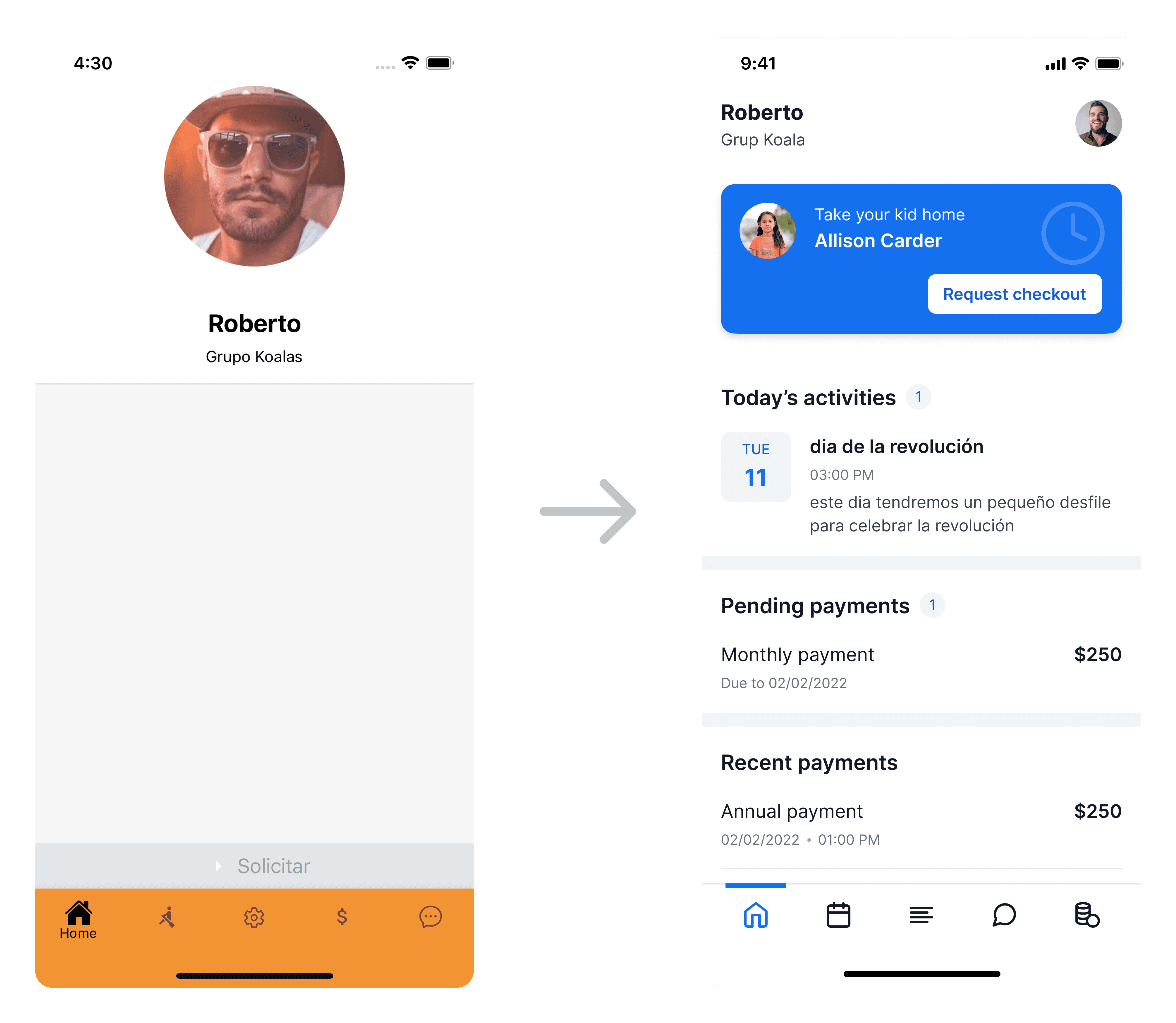
Fig. 2 - Before (Left) and After (Right) Comparison of the Home Page
Refining the Color Scheme
My client didn't provide any guidelines regarding colors and he informed me that I had no restrictions and had the freedom to choose any color. In my opinion, the existing use of color lacked direction. As you can see below, the primary color of the app was orange, but the buttons were red, and even the chat bubble was dark blue. I redefined the use of color to enhance the app's visual appeal, consistency, and overall balance. I designated blue as the primary color, green for success indicators, orange-yellow for warnings, and red for errors. Additionally, I created tints and shades of each color to provide depth and versatility for various visual scenarios and compositions. This approach ensures a harmonious and cohesive color palette throughout the app. Detailed documentation of the colors used in the design is included in the style guide.

Fig. 3 - Before (Left) and After (Right) Comparison of the Color Scheme
Addressing inconsistent spacing
the left-side area occupies more space than the right-side area. To rectify this inconsistency across the entire page, I applied the 8-point principle and established a grid guide. This implementation provides a clear visual hierarchy to elements and ensures consistent scalability, maintaining a cohesive visual rhythm. Additionally, it simplifies communication among developers, who can easily understand and visually assess 8-point increments without constant measurements. This standardization enhances efficiency and reduces ambiguity. A uniform grid system guarantees visual harmony and a refined design across different sections of the app. You can refer to the grid guide in the Style Guide for further details.
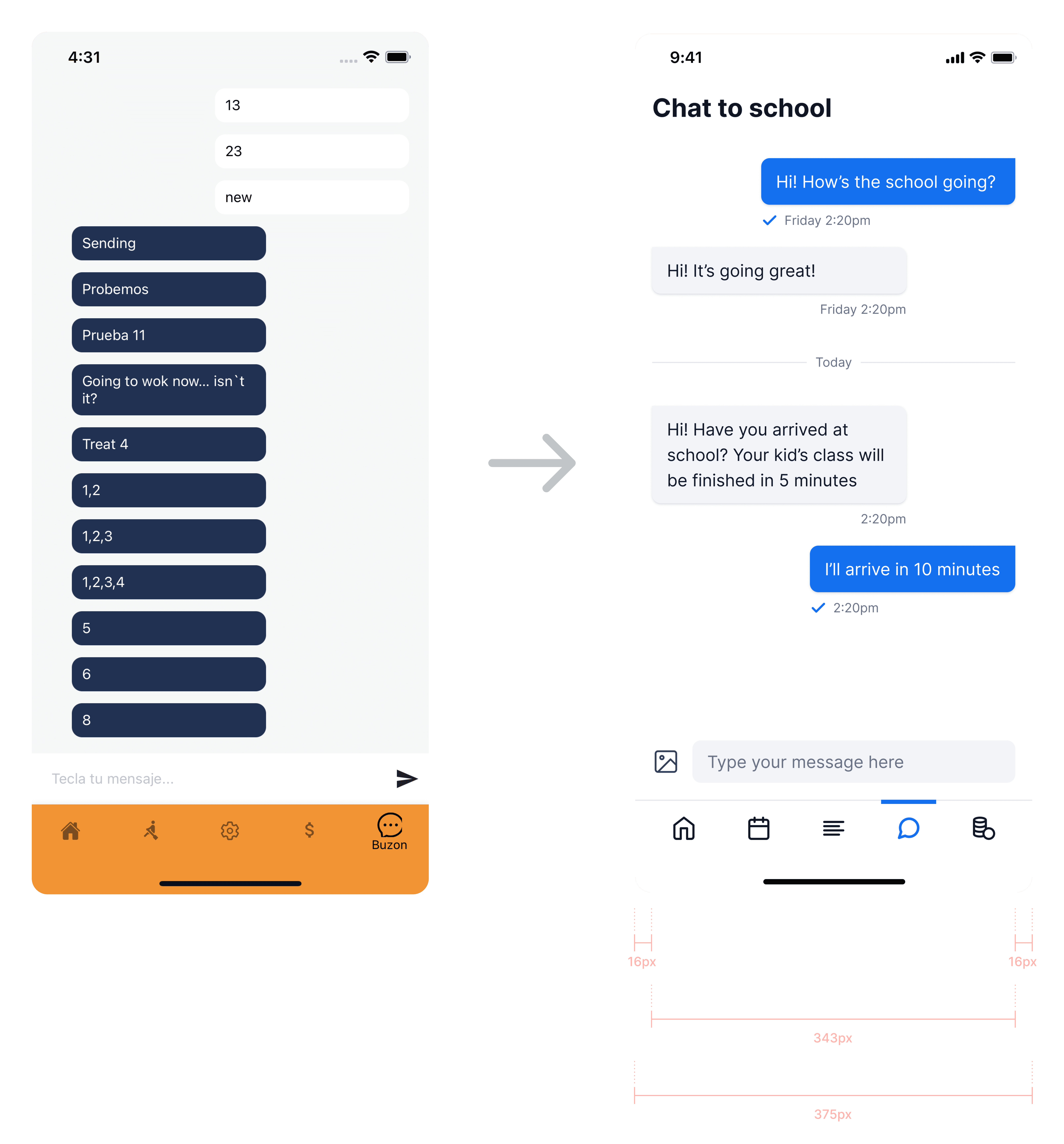
Fig. 4 - Before (Left) and After (Right) Comparison of the Spacing
Replacing the icons with ones that are more representative and share a similar style
Icons are, by definition, a visual representation of an object or action. If that object or action isn’t clear to users, the icon immediately lose it practical value and becomes a visual noise.
For instance, the feeds page originally utilized the "Gears" icon, commonly associated with settings pages. To address this issue, I replaced the irrelevant icon with one that better represents the intended object or action.
The existing app featured two types of icons: filled and outlined. In the redesign, I opted for outlined icons and replaced the filled icons accordingly. Using outlined icons offers several advantages: they provide clarity due to simpler shapes and consistent stroke widths, ensuring easy recognition. This uniformity in style enhances the aesthetic appeal of the app, providing a consistent visual language for users to navigate effortlessly.
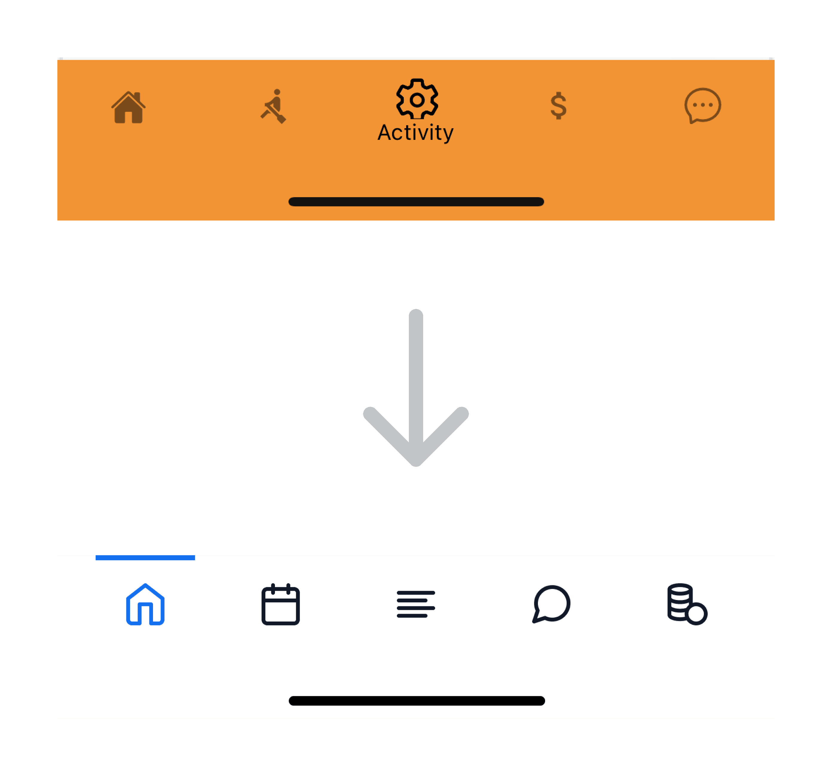
Fig. 5 - Before (Top) and After (Bottom) Comparison of the Icons
Style Guide
Colors
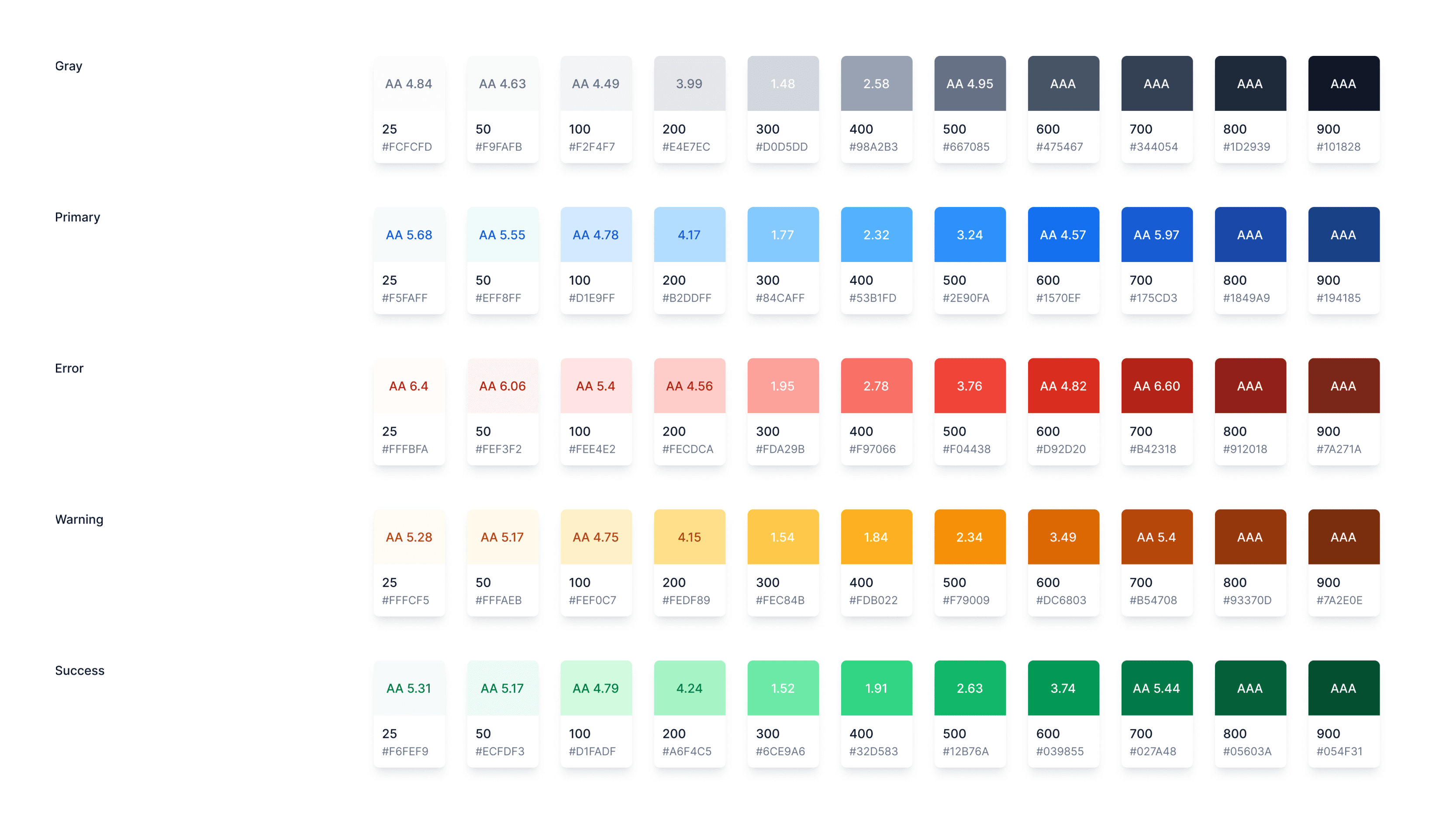
Fig. 6 - Color Guide Along with Their WCAG Contrast Ratio
Typography
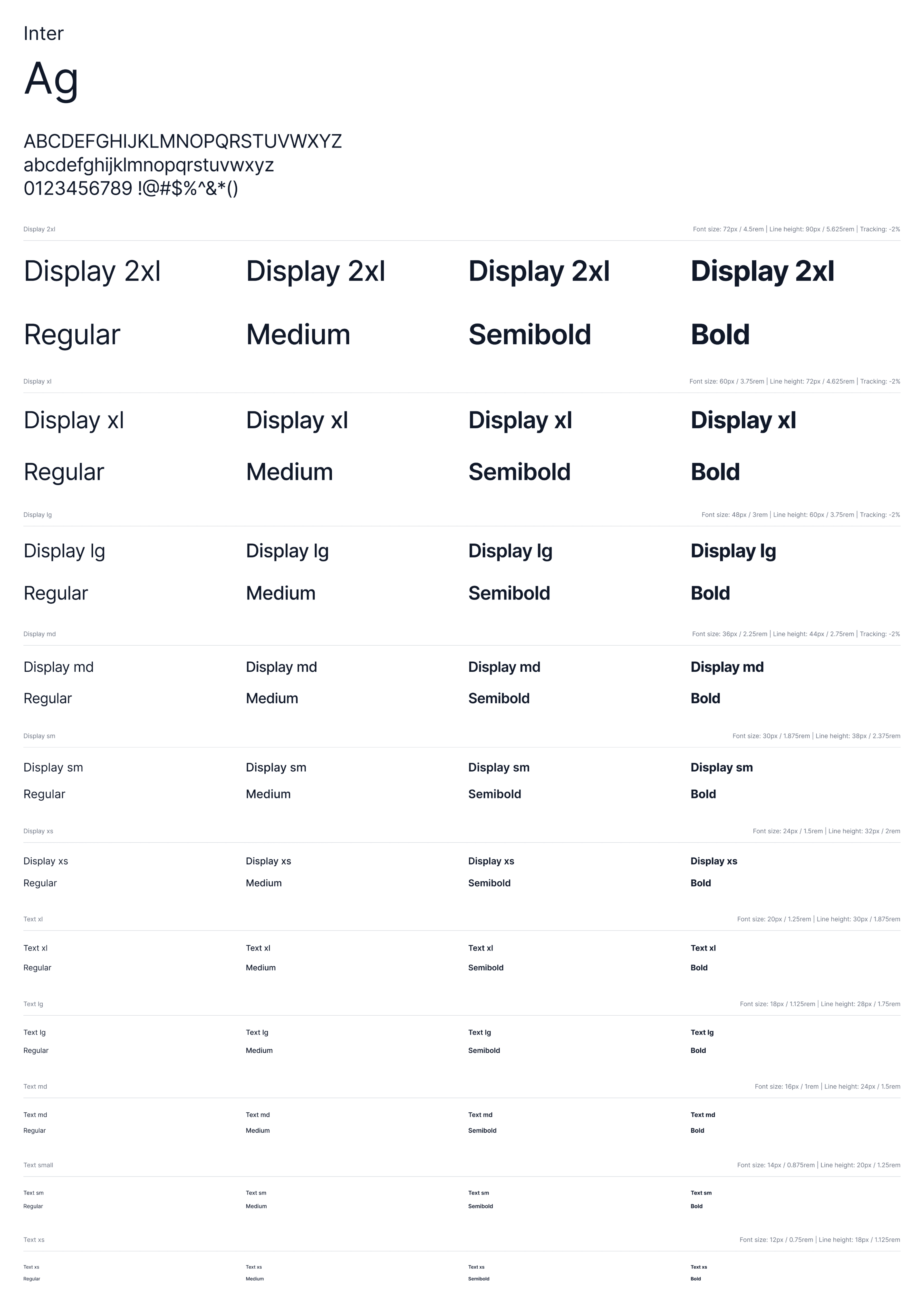
Fig. 7 - Typography Guide Along with Their Properties
Grids
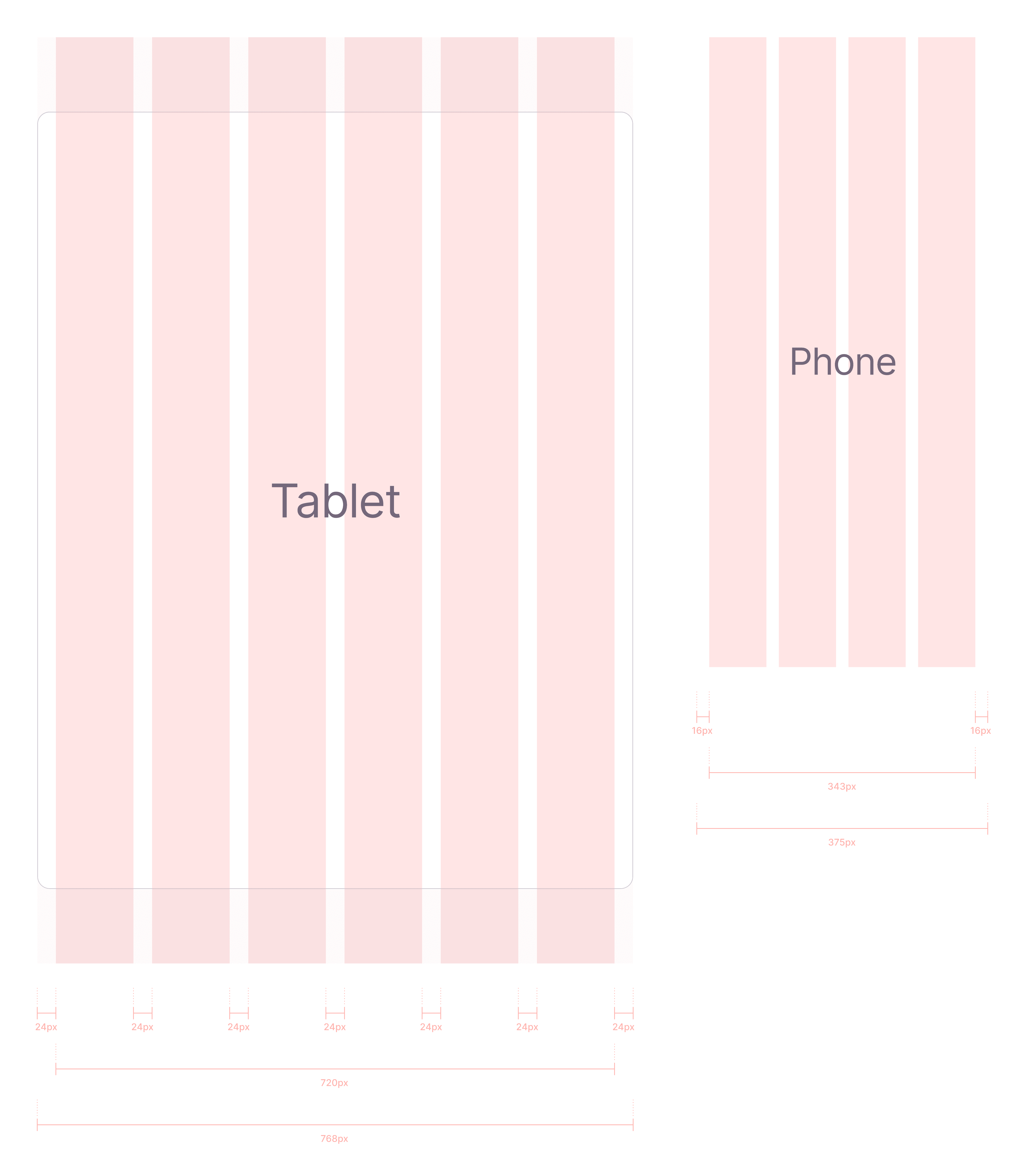
Fig. 8 - Grid Guide for Phone and Tablet
Design components
I prepared and defined the components that I use in the design for the developers to use. I applied atomic design principle for managing the components.
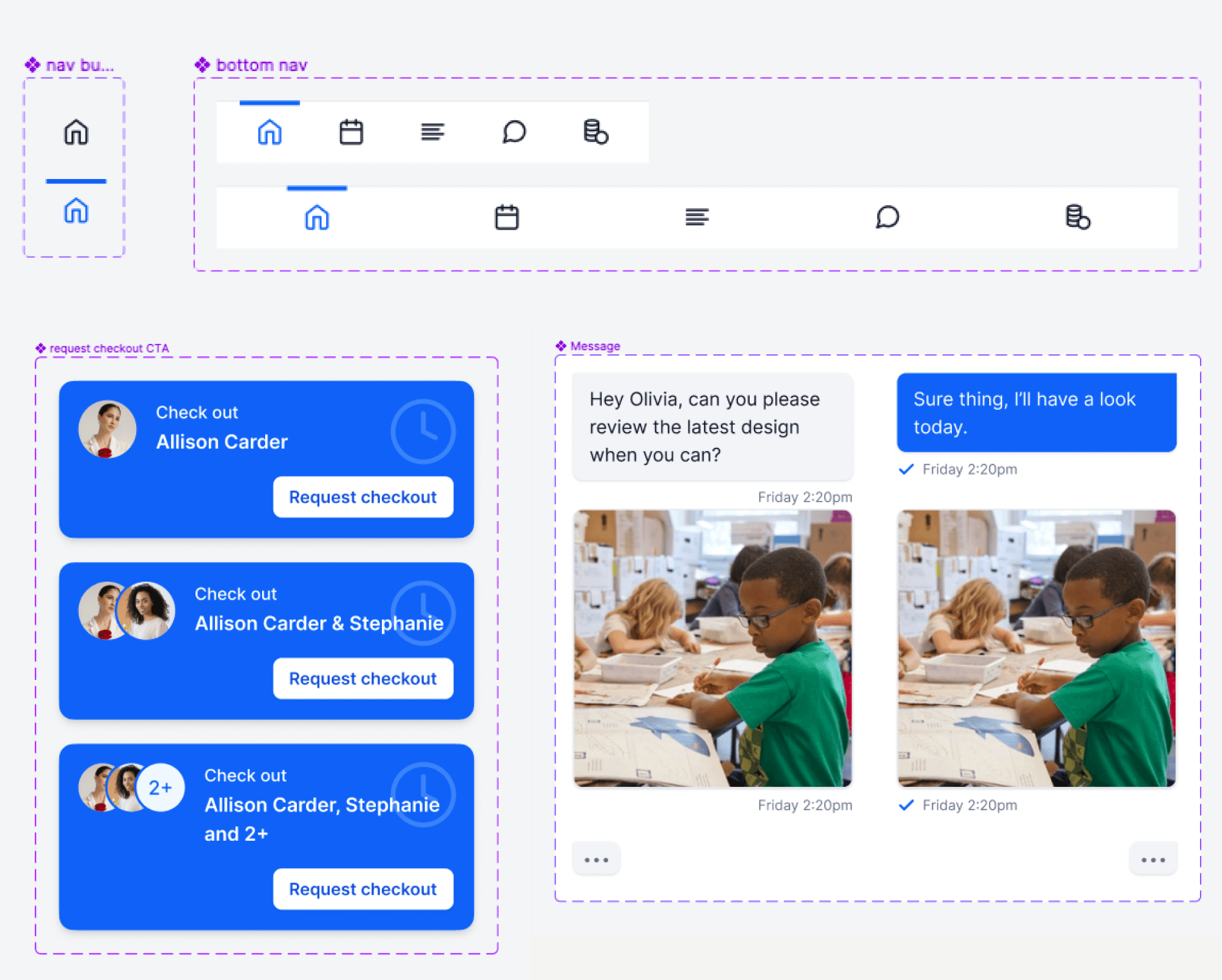
Fig. 9 - Some of Design Components
Key takeaways
Streamlining information
Recognizing the home page as a critical starting point, introducing valuable content sections, and redesigning crucial elements streamlined user experience, emphasizing the importance of thoughtful design decisions.
Creating a nice and consistent look
In the absence of color guidelines, refining the color scheme for visual appeal taught the importance of consistent color usage and documenting choices in a Style Guide to ensure a harmonious and pleasing visual.
Using grids for a clean and consisten App layout
Addressing inconsistent spacing through a grid guide highlighted the significance of an organized layout. A consistent grid system ensures visual harmony and a polished design across various sections of the app.
Making icons clear
By introducing relevant icons and establishing a standardized style, we enhanced visual cohesion, resulting in a clearer and more appealing visual language.